
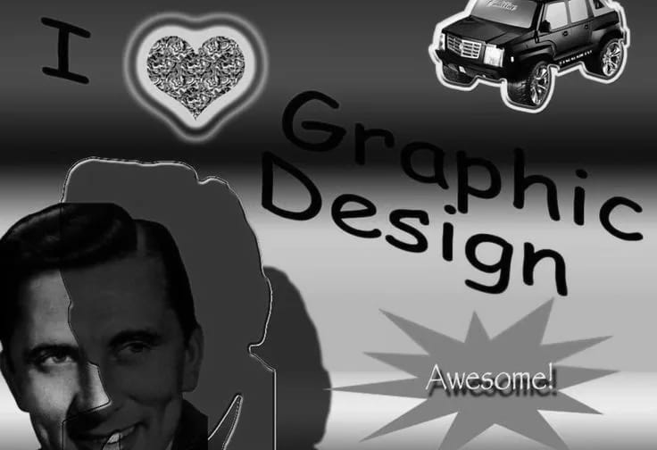
Remember when branding was all about clean, polished,aestheticvisuals? Yeah, so does everyone else - which is exactly why brands are ditching that playbook and embracing something raw, chaotic, and, let’s be honest, kind of ugly.
From distorted blurred typography to neon color clashes and early-2000s web nostalgia, a wave of “anti-design” is taking over. It’s bold, rebellious, and, for better or worse, impossible to ignore.

But why is this happening? And should every brand start making their logos look like they were designed in Microsoft Paint? Let’s break it down.
What Is ‘Ugly’ Branding, Exactly?
It’s branding thatshouldn’twork - but does. It’s messy, unpolished, and deliberately chaotic. We’re talking:
- Overlapping, clashing fonts
- Pixelated graphics and low-fi aesthetics
- Unconventional layouts that break all the rules
- Bold, almost obnoxious color combinations
- Retro web design vibes (think early MySpace meets Windows 98)
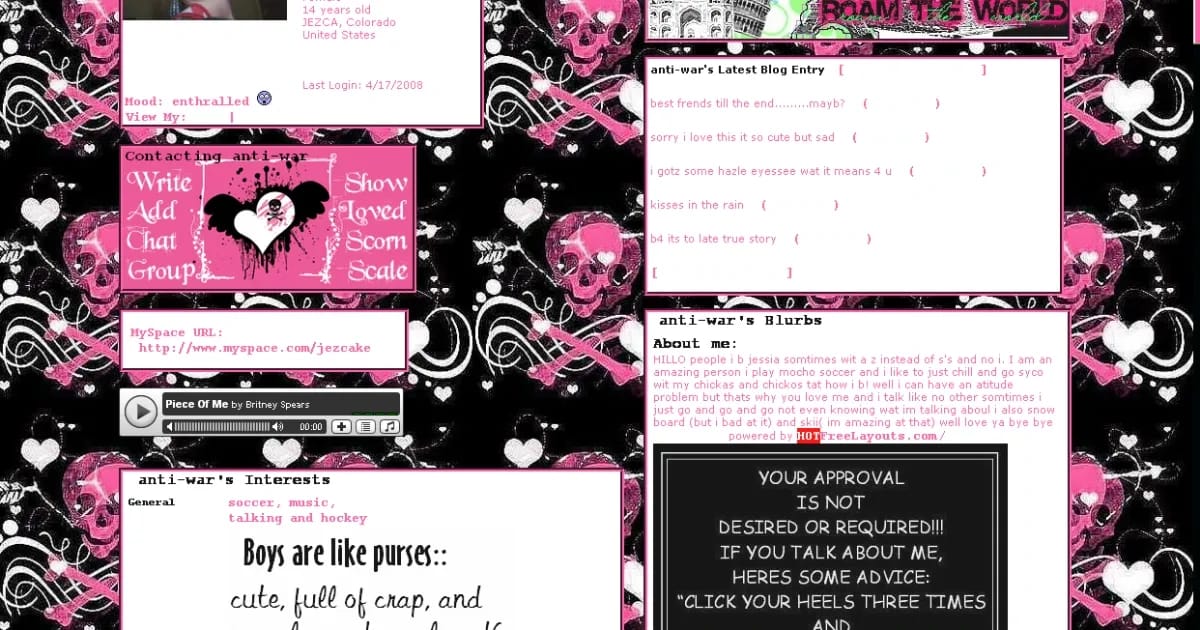
At its core, ugly branding is a reaction to the overly clean, hyper-minimalist branding trend that dominated for years. It’s a rebellion againsttoo much perfection.
Brands are realizing that consumers (especially Gen Z) are craving somethingreal. Something that doesn’t feel like it was meticulously optimized by a corporate AI.
Why Are People Loving This? (The Psychology Behind the Chaos)
Here’s the thing: ugly branding isn’t just a visual trend - it’s a cultural shift.
Imperfection = Authenticity
People are tired of everything lookingtoo perfect. Ugly branding feels more raw, more human, and that makes it feelreal.
Nostalgia Hits Hard
Early 2000s web design, ‘bad’ PowerPoint graphics, and chaotic DIY aesthetics remind people of simpler times. (Remember how fun it was customizing your MySpace page? Exactly.)
Social Media Loves ‘Weird’
Think about the brands that go viral on TikTok and Instagram - it’s rarely the polished, corporate ones. People engage with content that feels fun, unexpected, and sometimes, yes,a little ugly.

Brands That Are Doing ‘Ugly’ Right
Some brands have fully embraced this chaotic energy and turned it into a brandingpower move.
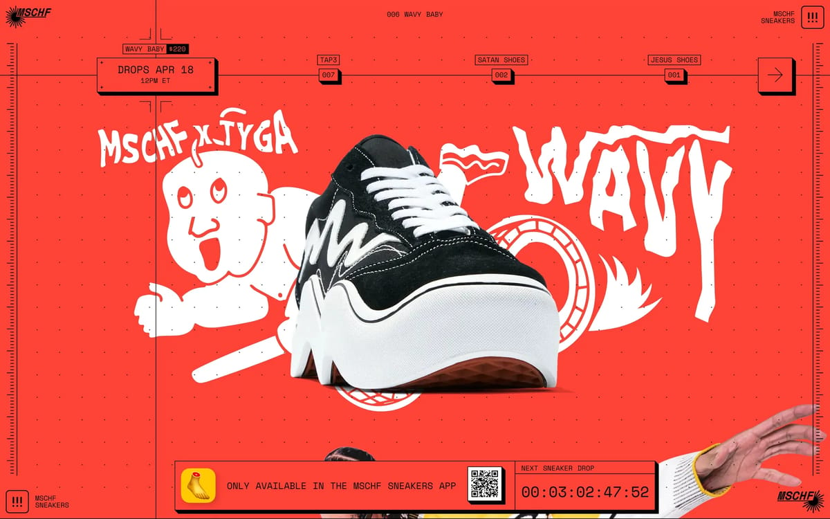
🔥MSCHF– A brand built entirely around chaos and trolling. (They literally made Jesus shoes filled with holy water. Enough said.)
🔥Crocs– Once considered the ugliest shoes on the planet. Now? A full-on cultural icon.
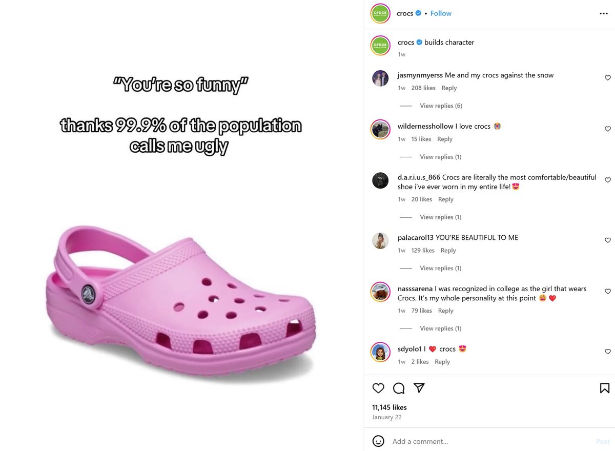
These brands prove that when doneright, ugly branding isn’t just eye-catching—it’s strategic.
But… When Does ‘Ugly’ Go Wrong?
Not every brand should slap on some Comic Sans and call it a day. Here’s when this trendbackfires:
🚨When It Feels Forced– If your audience doesn’t vibe with chaotic aesthetics, it’ll just look like a bad design choice, not a creative one.
🚨When There’s No Strategy– Ugly branding works when there’s intention behind it. If it’s uglyjust because, people will assume you just didn’t hire a good designer.
🚨When It Confuses Your Audience– If your brand has always been sleek and professional, suddenly going full Y2K grunge might just alienate your existing audience.
So… Is Ugly Branding Here to Stay?
Honestly? Yes and no.
Like all trends, it’ll evolve. Right now, we’re in the era of chaotic, nostalgic, “ugly-on-purpose” design. But in a few years? Who knows. Maybe we’ll swing back to ultra-polished branding again. (Design trends are basically a never-ending pendulum.)
But here’s whatwillstick around:the demand for authenticity.
Whether that’s through anti-design, DIY aesthetics, or just more brands embracing personality over perfection, the key takeaway here is that people don’t just wantpretty- they wantreal.
So, if you’re thinking of experimenting with a little chaos in your branding, go for it. Just make sure it’sstrategicchaos.
[ Related reads ]
All journal →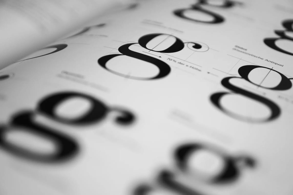
Essay · JAN 2025 · 5 min
Minimalism, maximalism, and the soul of branding
Culture · JUN 2025 · 6 min
Gen Z: how they are transforming digital media tools into their creative playground

Essay · AUG 2024 · 5 min