Farés
Client
Farés
Sector
Marketing Consultancy
Country
Brazil
Year
2025
Scope
Strategy · Visual Identity · Verbal Identity
[ 01 — Context ]
Farés is a marketing consultancy with over 15 years of experience, built on a positioning that starts with the name itself: in Hebrew, Farés means "one who breaks through, who opens paths." The client needed an identity that matched that authority — premium, sophisticated, and immediately credible to corporate-level decision makers.
[ 02 — Approach ]
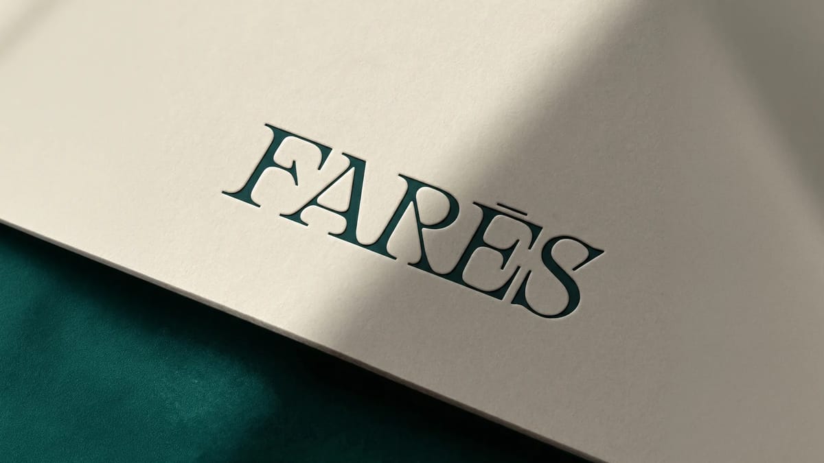
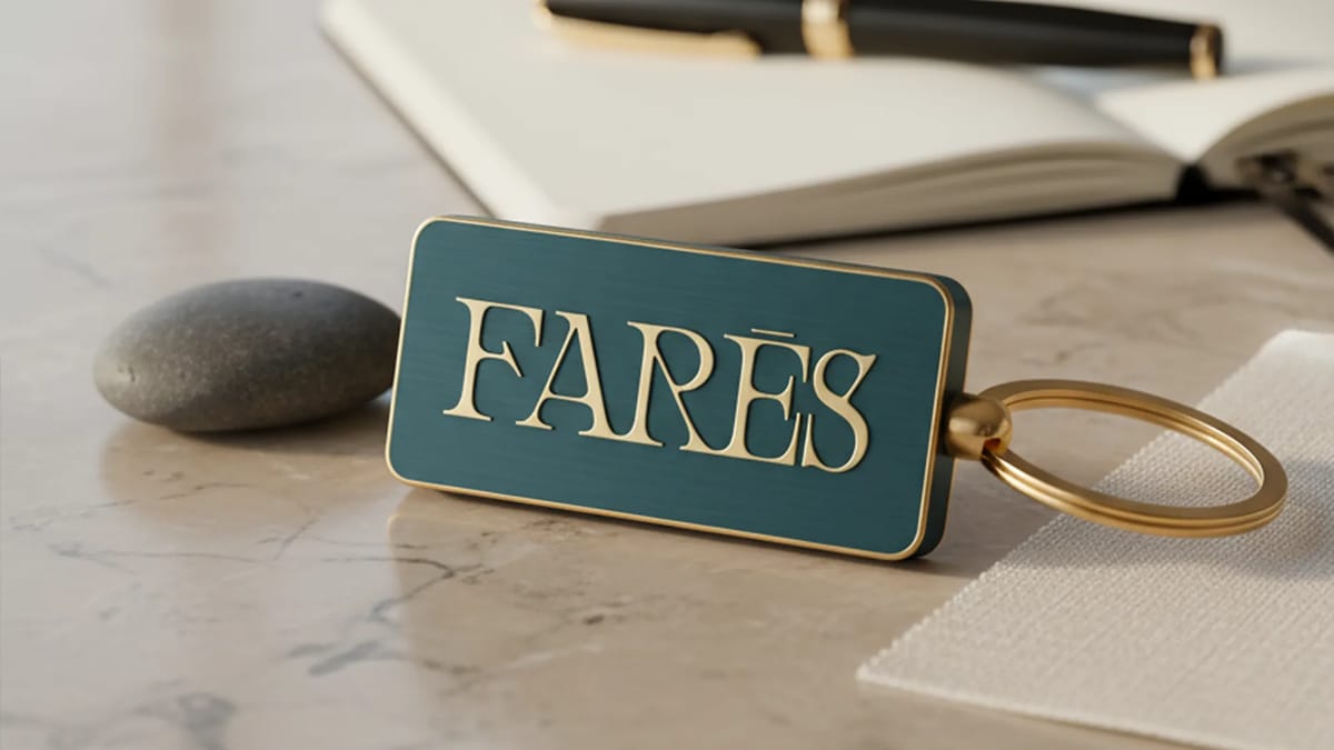
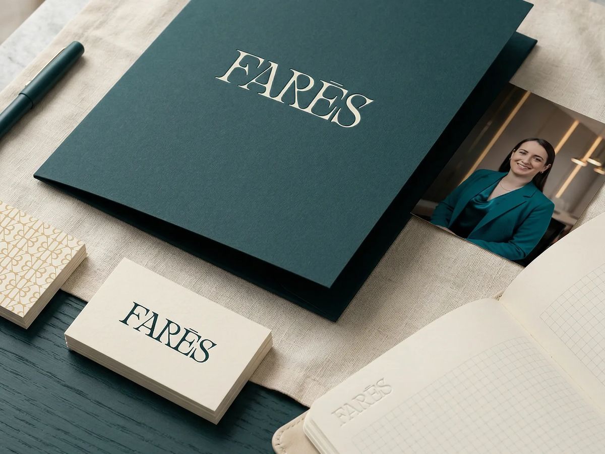
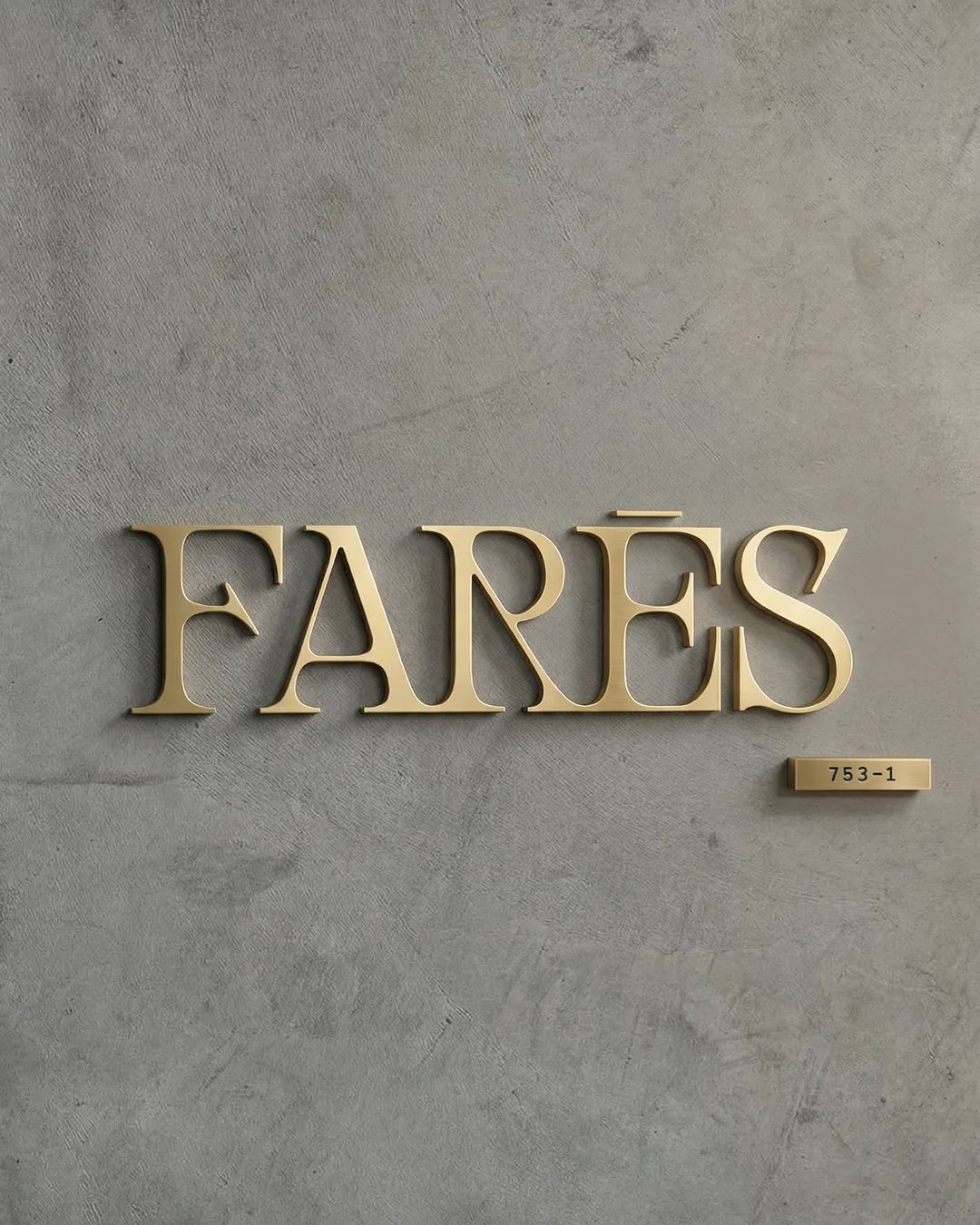
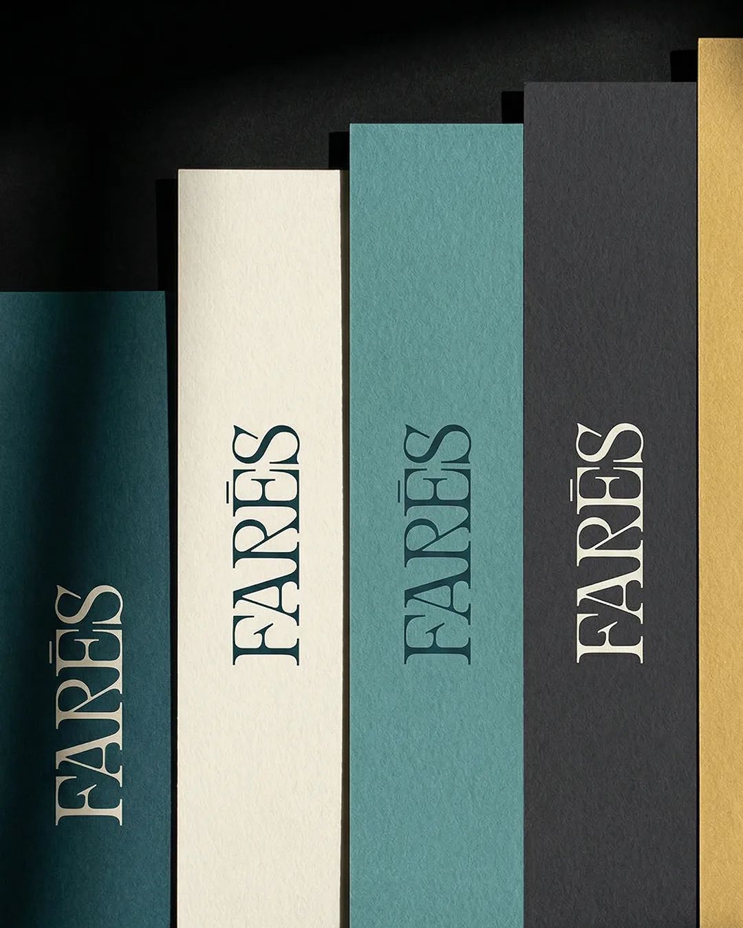
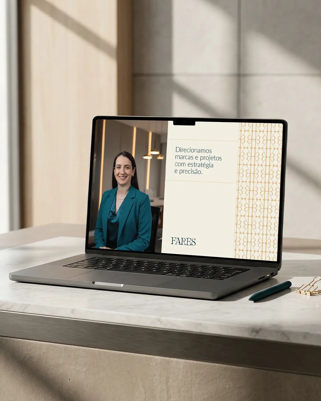
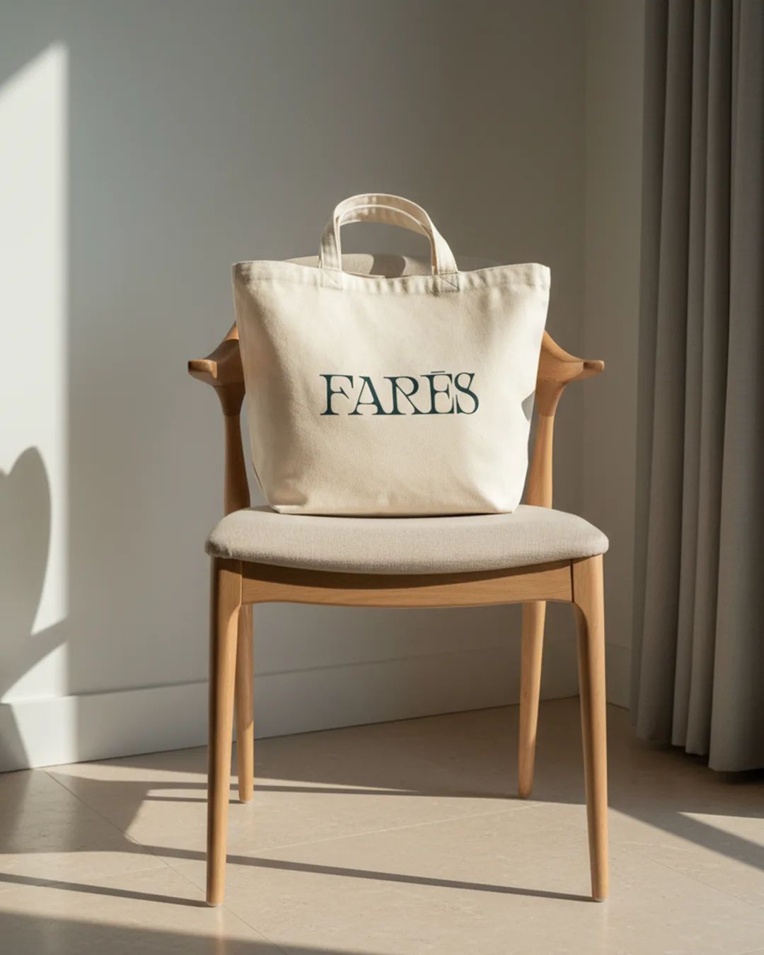
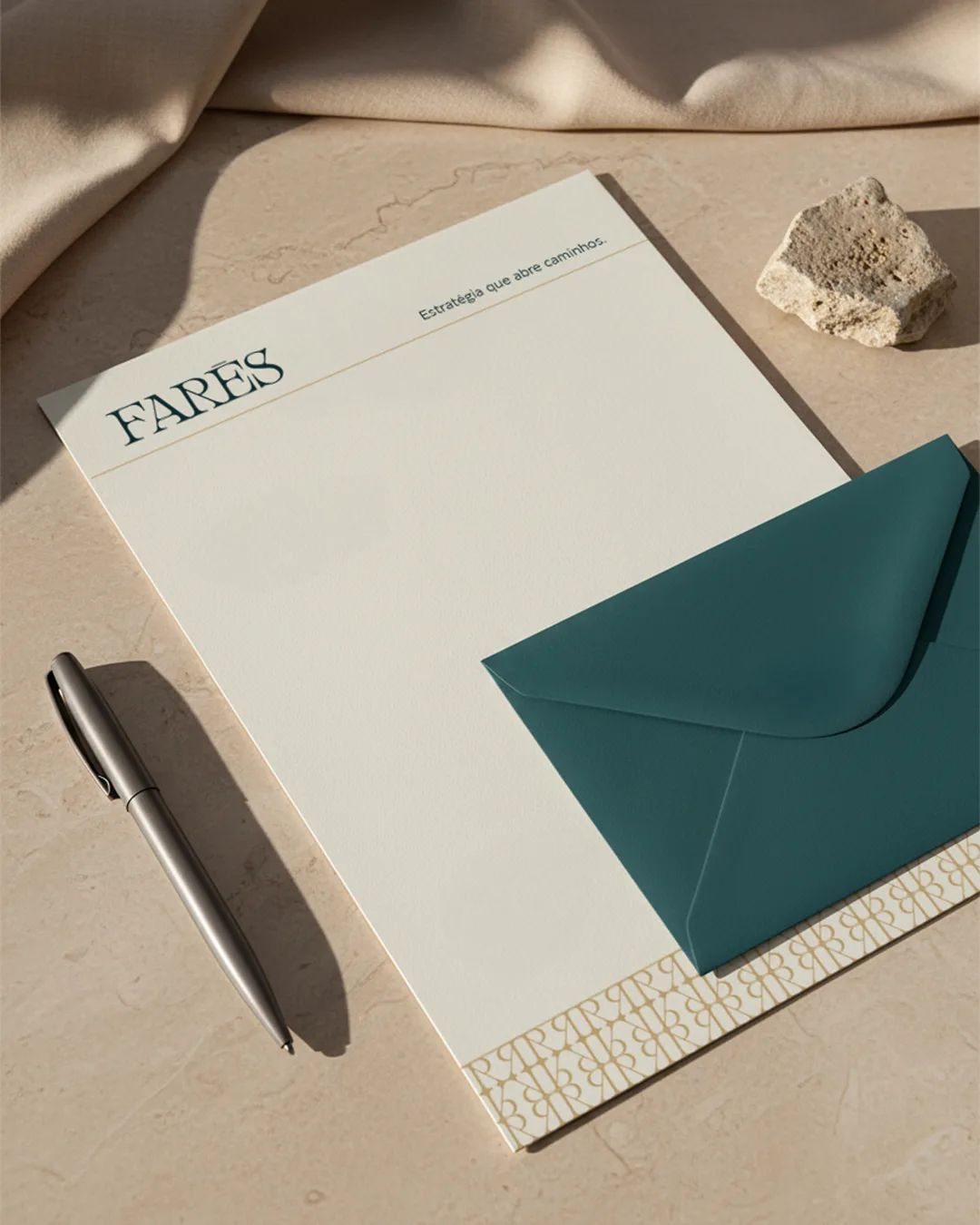
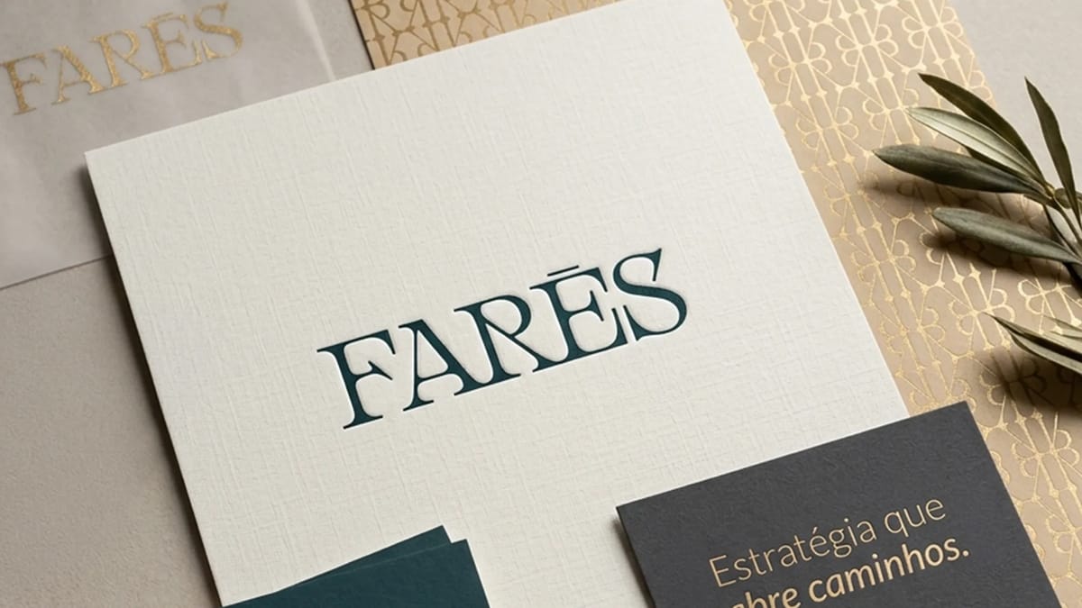
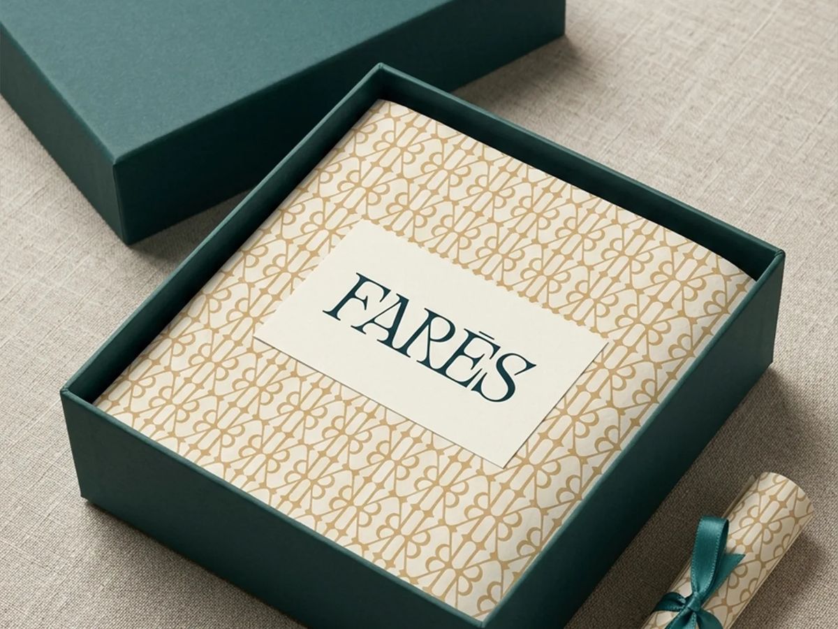
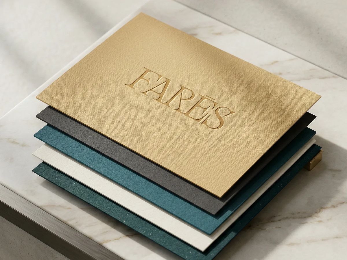
The identity is entirely typographic: no icon, no ornament — just a custom serif wordmark where the letterforms carry all the weight. The contrast between thick and thin strokes communicates solidity and refinement simultaneously. The macron on the Ē functions as a mark of distinction, signaling that every decision in this system was intentional. Color anchors the premium register: deep petroleum teal as the primary, warm gold used sparingly for contrast. A pattern derived from the letter R adds texture without competing with the mark.
[ 03 — Outcome ]
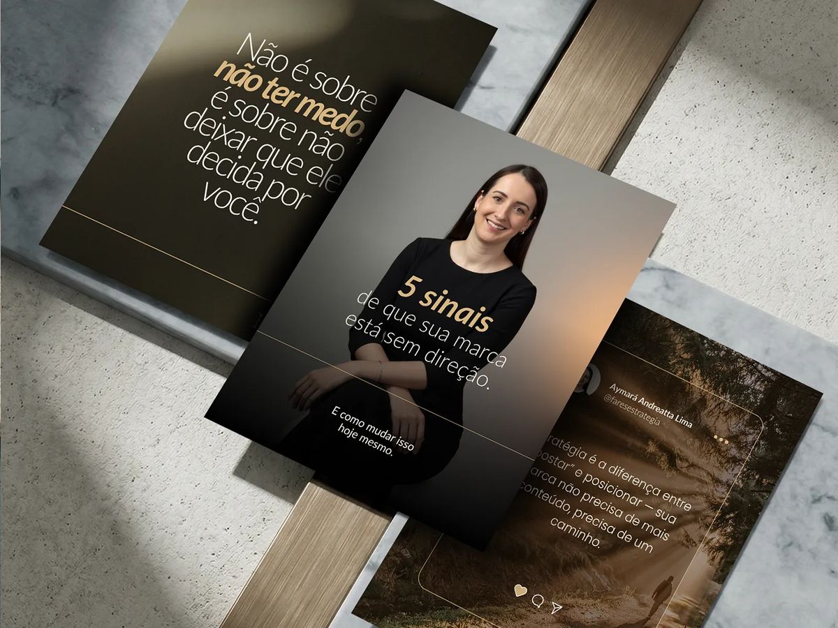
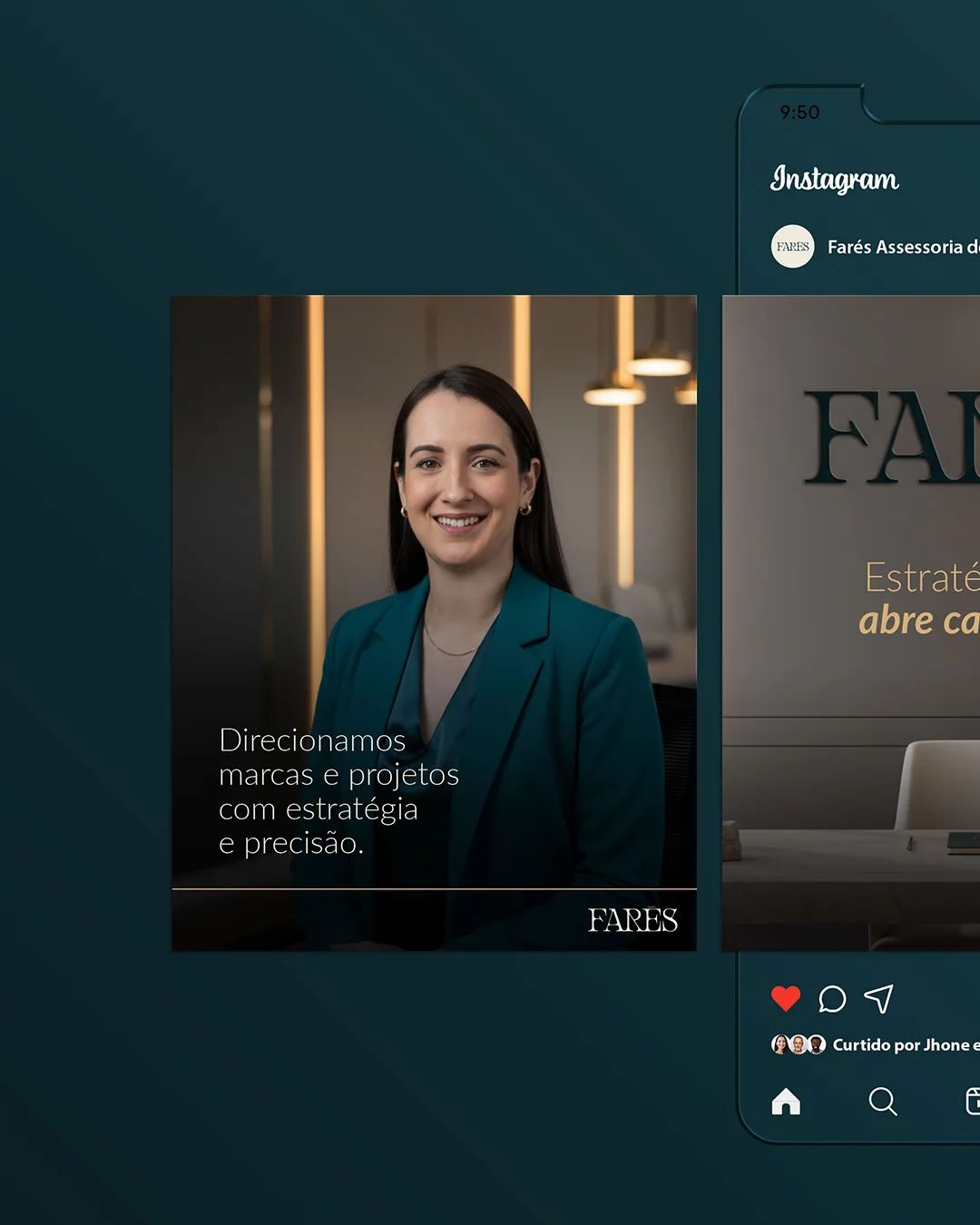
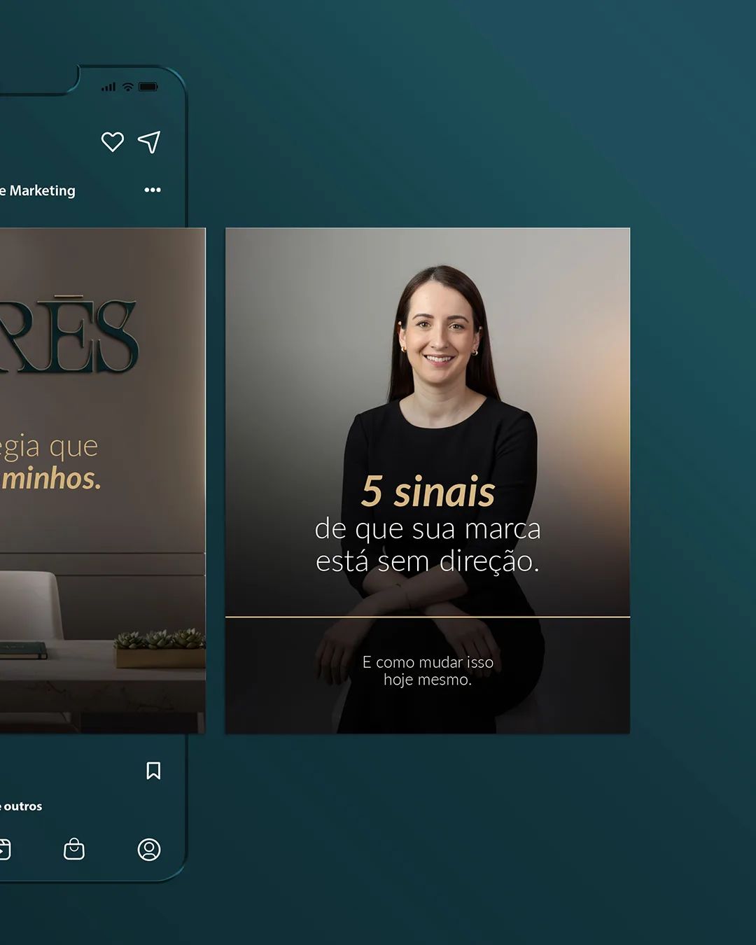
Delivered a complete brand system: visual identity, brand book, social media templates, and photography direction. The result landed beyond expectations. "It was so spot-on that I was moved to tears when it was presented. I recommend it with my eyes closed!"
[ Testimonial ]
Working with Mellow and Anne is always a great experience — she is extremely professional and focused, bringing depth and excellence to everything she does. Having already known her work, I knew something great was coming, but it went far beyond what I expected. It was so spot-on that I was moved to tears when it was presented. I recommend it with my eyes closed!
Aymará Andreatta
Founder · Farés