Suellen Georg
Client
Suellen Georg
Sector
Architecture
Country
Brazil
Year
2025
Scope
Visual Identity · Verbal Identity
[ 01 — Context ]
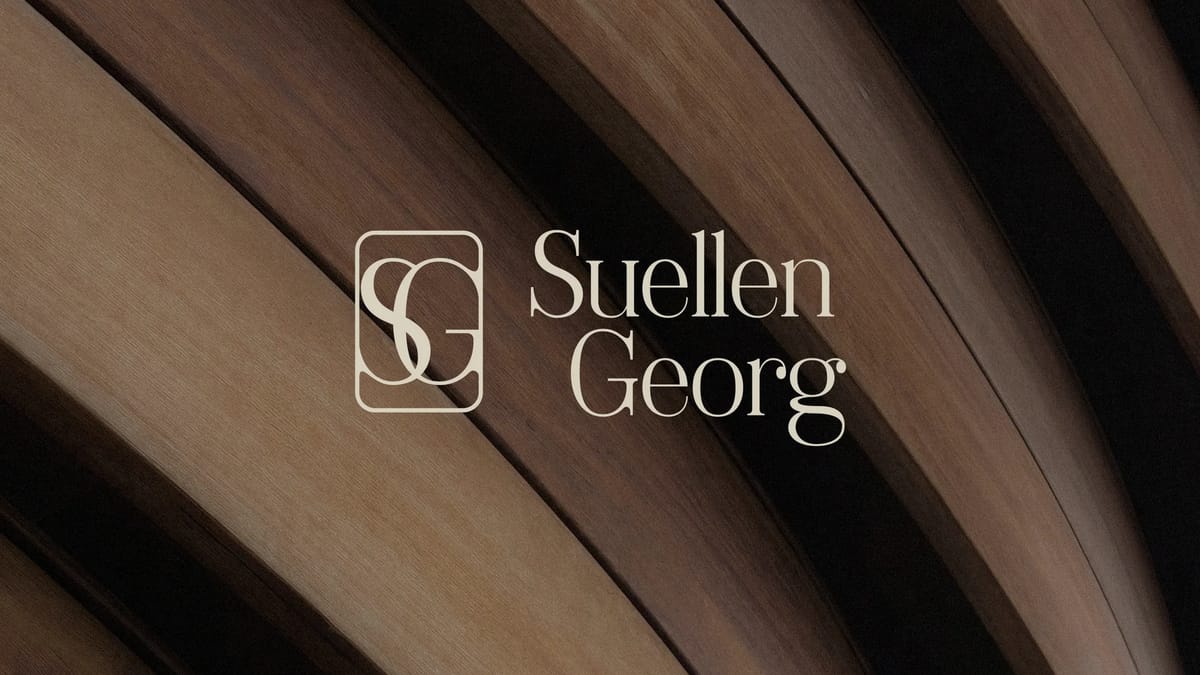
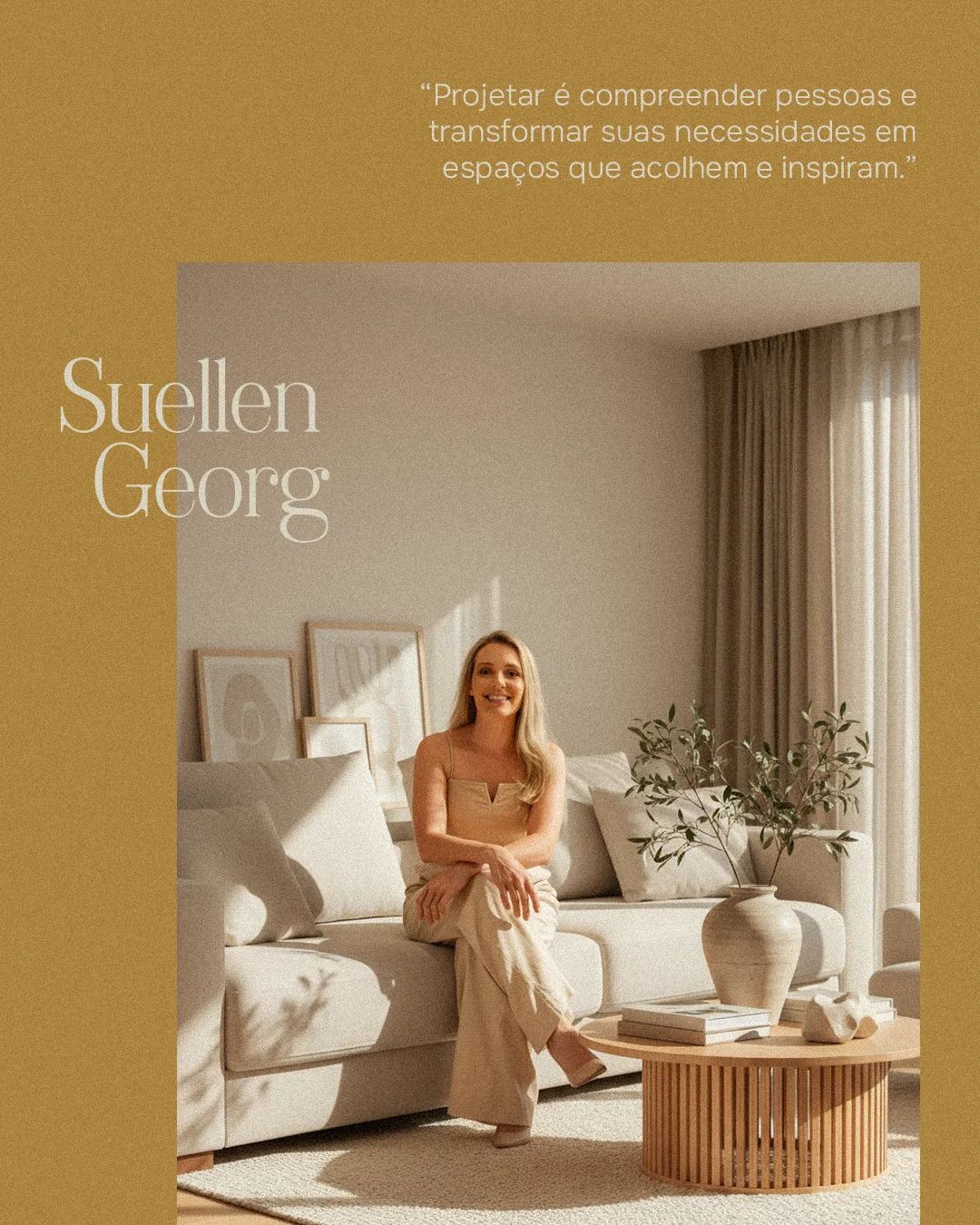
Suellen Georg is an architect based in Brazil with over a decade of practice. She came to us needing more than a visual refresh — her brand was ten years old, and she was entering a new professional and personal phase that the existing identity no longer reflected.
[ 02 — Approach ]
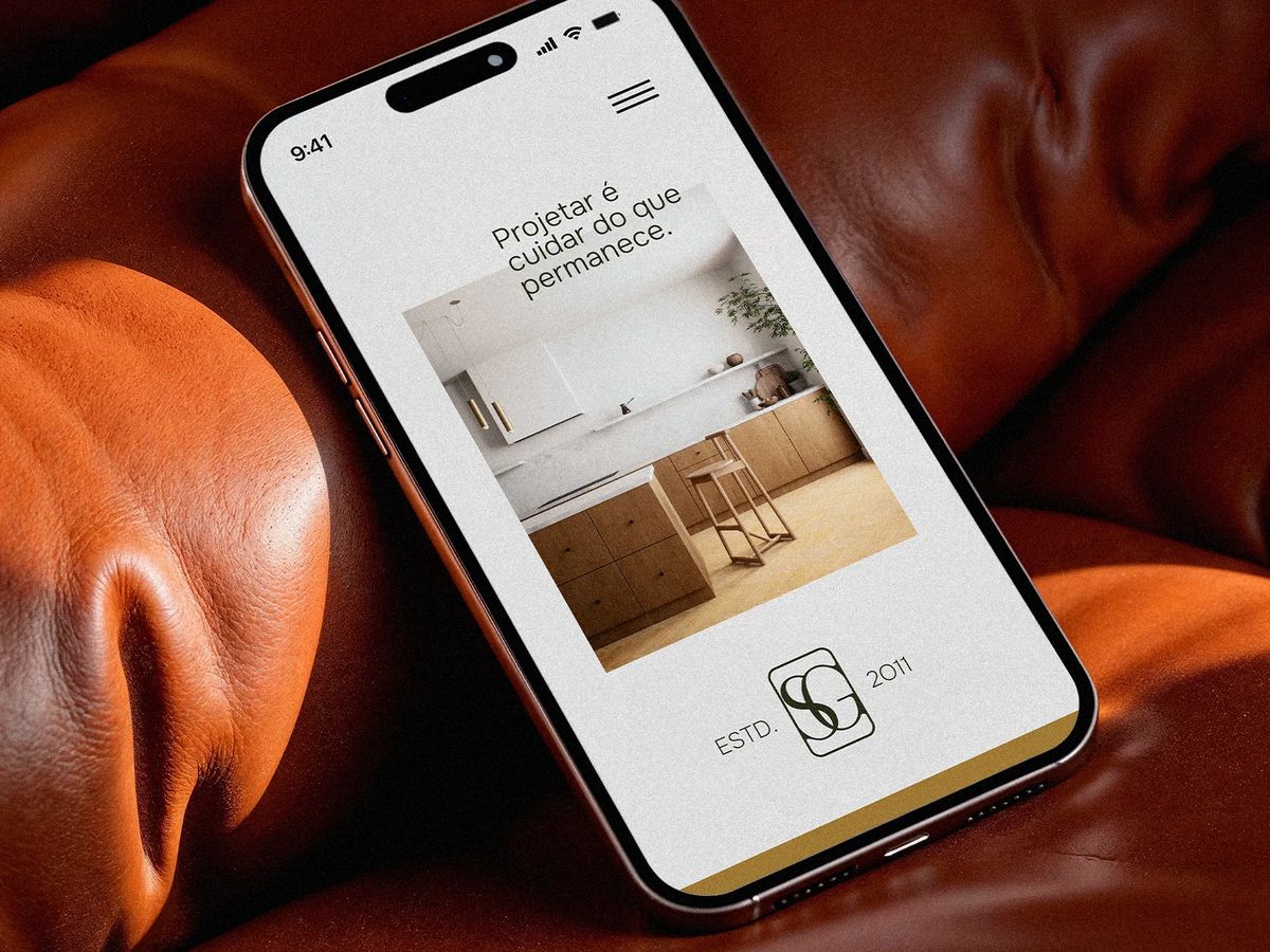
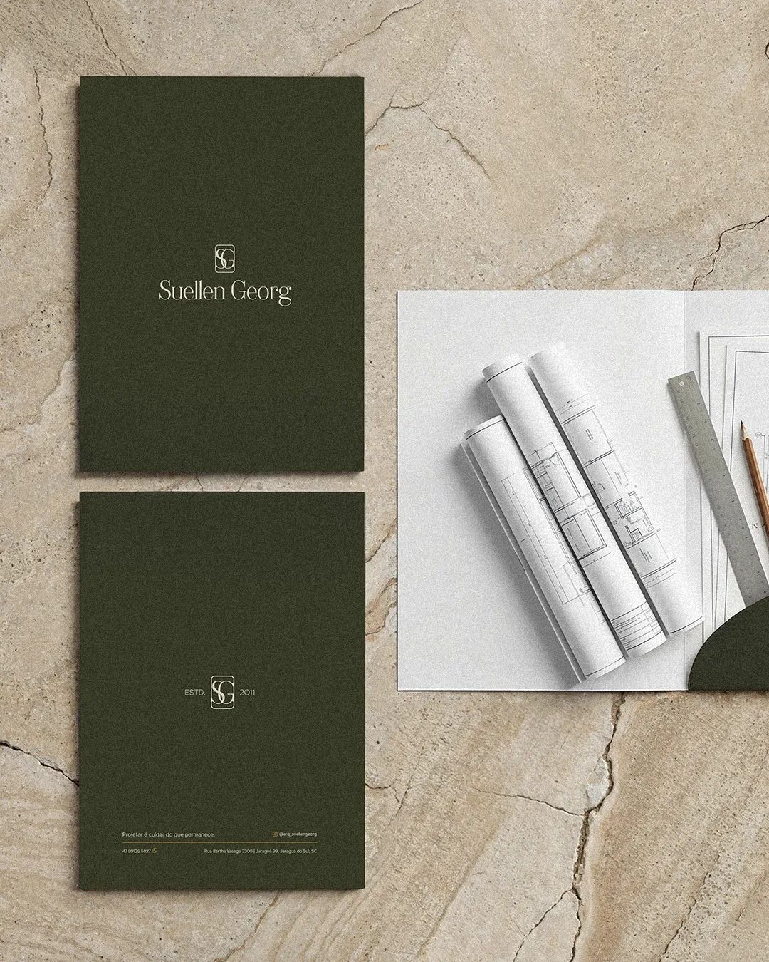
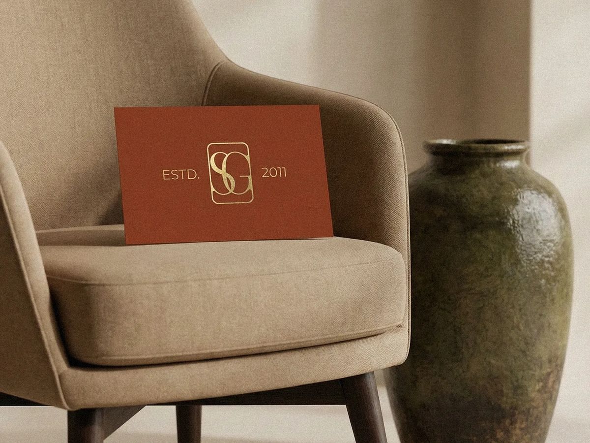
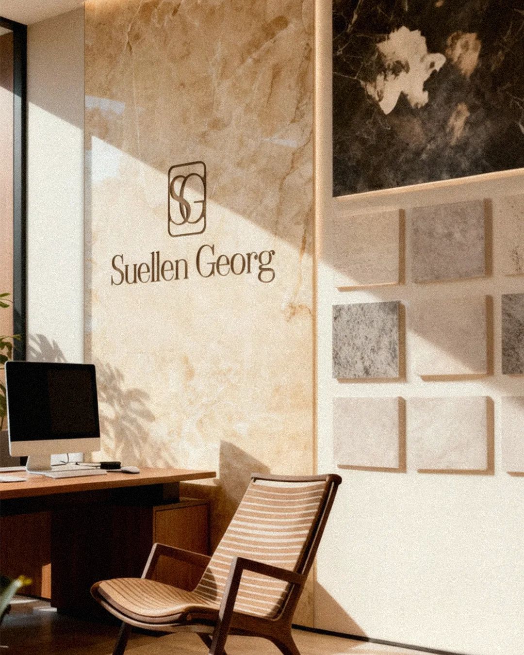
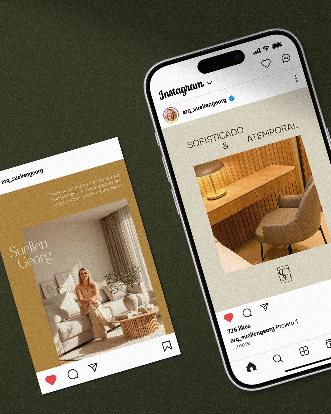
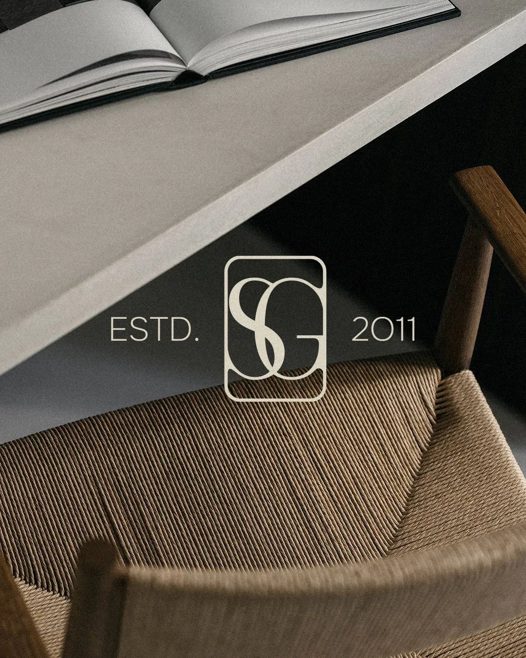
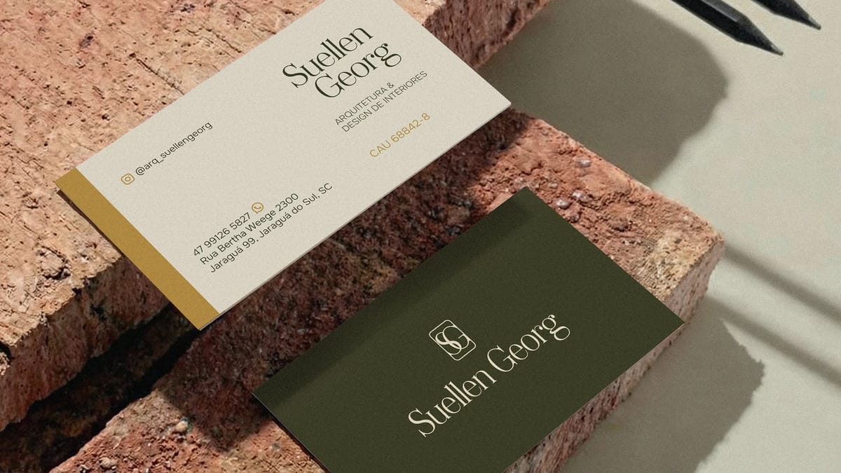
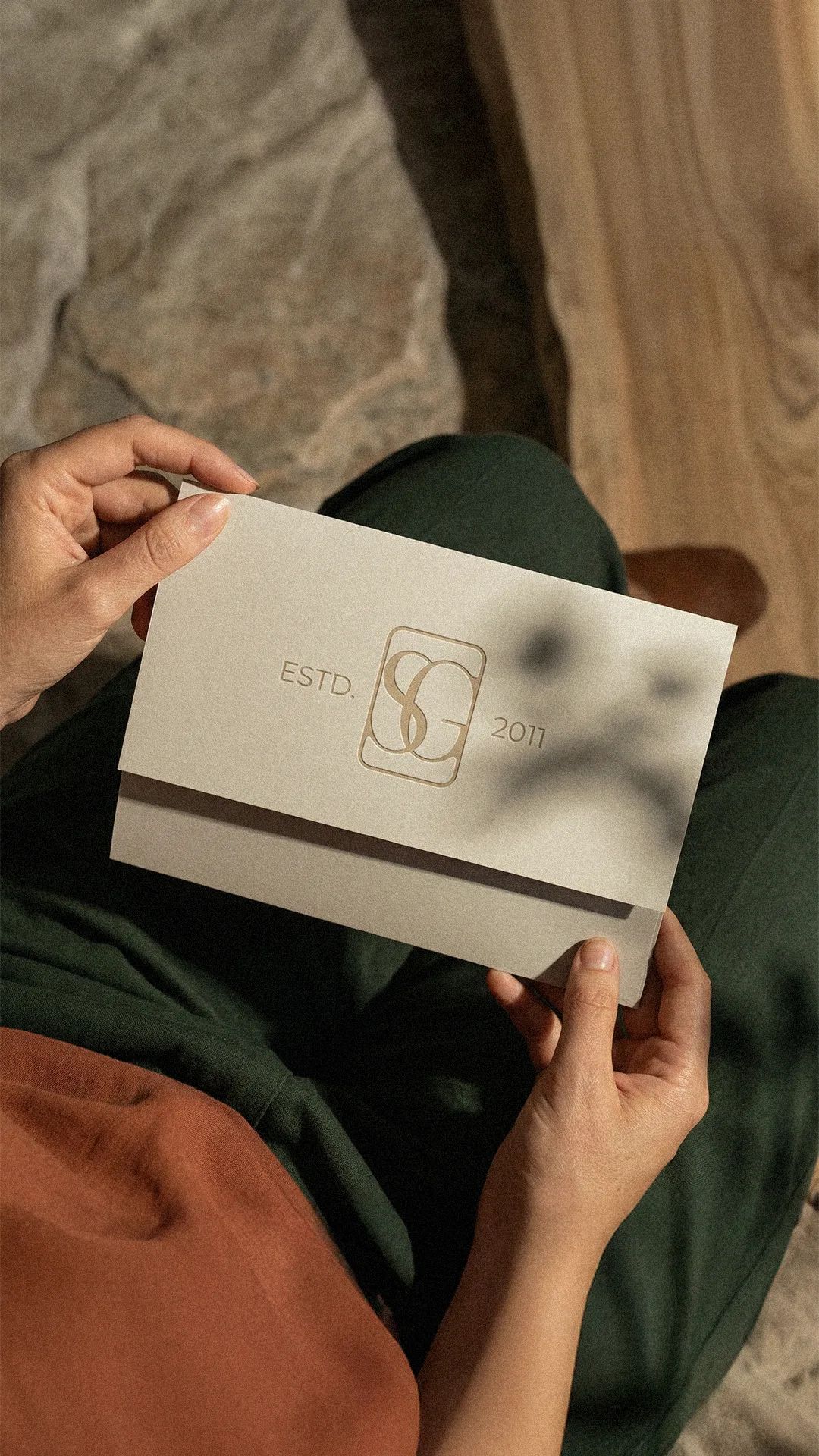
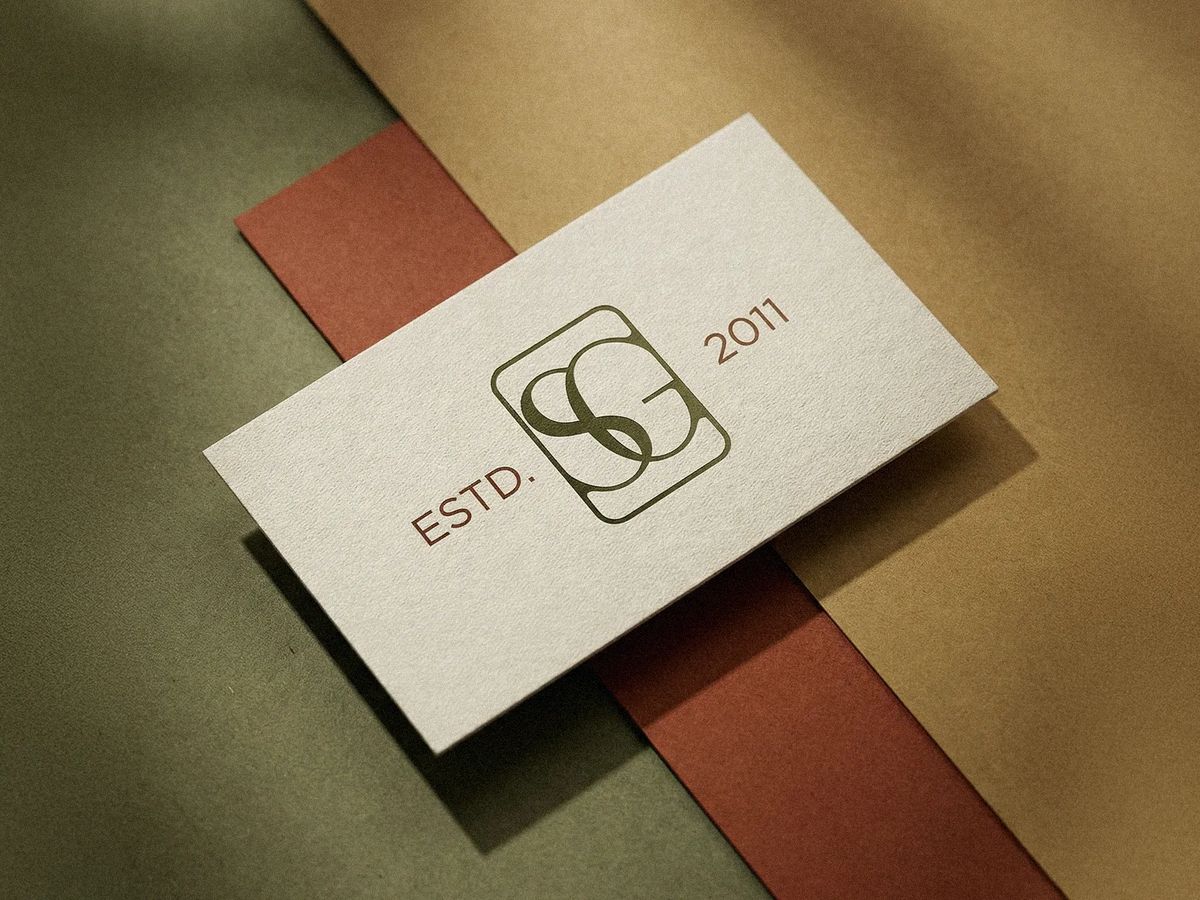
The work began with a strategy immersion that established the brand's positioning around timeless elegance, technical rigor, and human warmth. The monogram "SG" was built as an interlocking form where balanced curves signal empathy and flow, while the geometric frame holds structure and reliability. The palette anchors in warm off-white and olive green, grounded by terracotta, sand, and matte gold — all calibrated to sit at the intersection of natural materials and quiet sophistication.
[ 03 — Outcome ]
The delivered system includes the full identity, brand book, and usage guidelines. The rebrand is already shifting how Suellen Georg shows up in the market. "I noticed an excellent reading of the current moment, with focus on the future and what the brand represents for me and for the market. I'm already advancing in positioning, and the new brand has helped enormously."



[ Testimonial ]
My goal when hiring Anne was to restructure my brand, which was already about ten years old — I felt the need to align it with a new phase of my personal and professional life. The service and organization were impeccable throughout, with clear direction from start to finish. I noticed an excellent reading of the current moment, with focus on the future and what the brand represents for me and for the market. I'm already advancing in positioning, and the new brand has helped enormously.
Suellen Georg
Founder · Suellen Georg