Nortech
Client
Nortech
Sector
Technology for Infrastructure
Country
Brazil
Year
2025
Scope
Strategy · Digital Plan · Visual Identity · Verbal Identity · LinkedIn Strategy & Management · Content Production
[ 01 — Context ]
A tech company operating across Brazil — digitizing sanitation infrastructure for industries — with a 2–3 year-old brand that no longer matched where the business was heading.
[ 02 — Approach ]
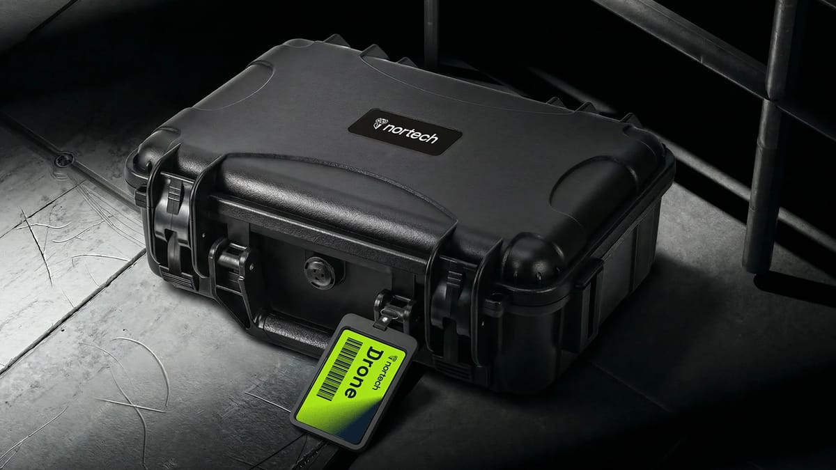
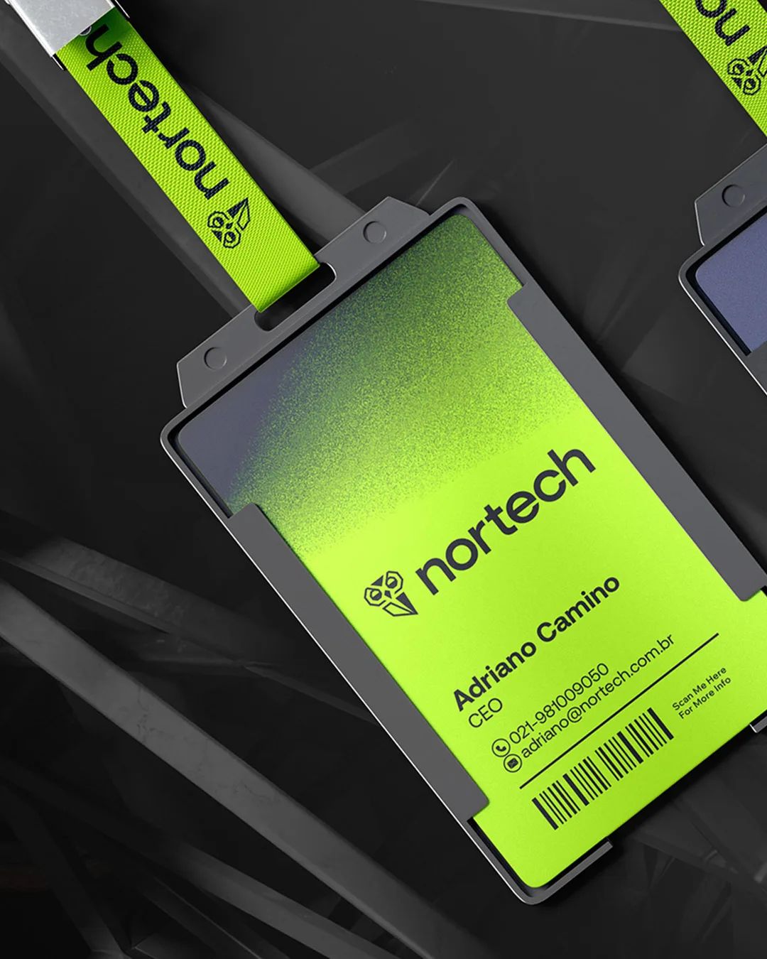
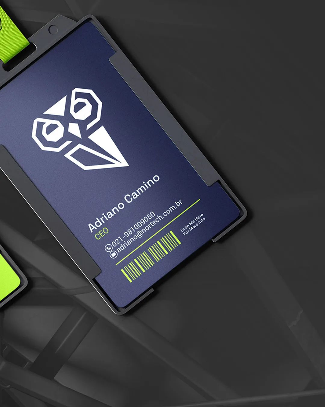
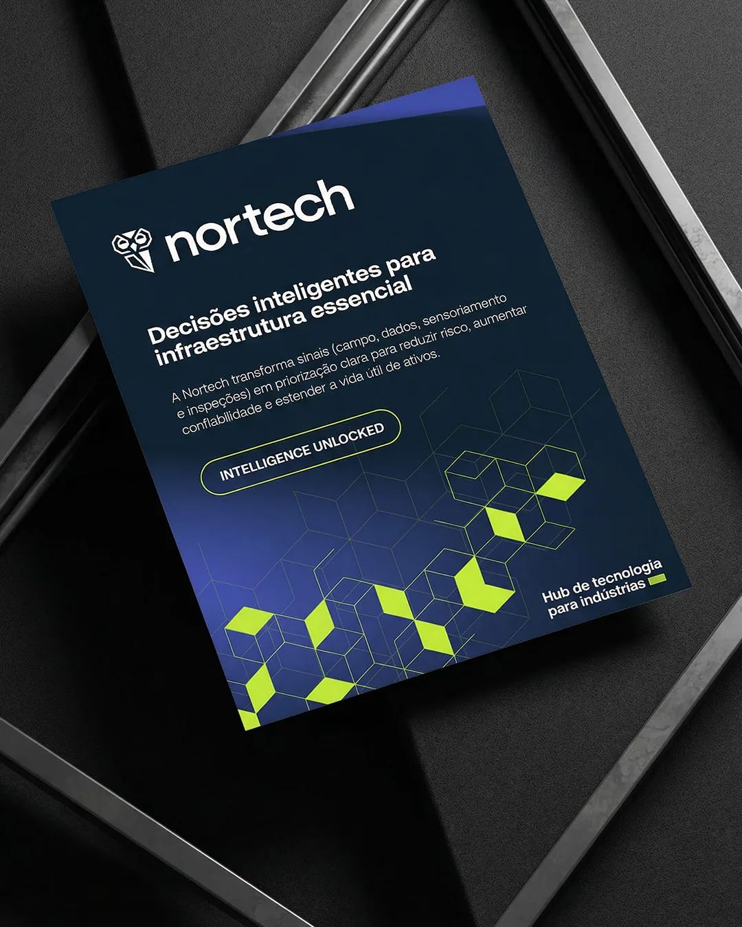
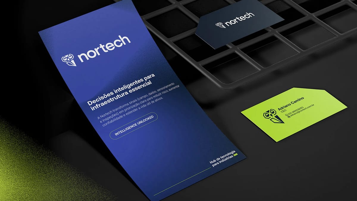
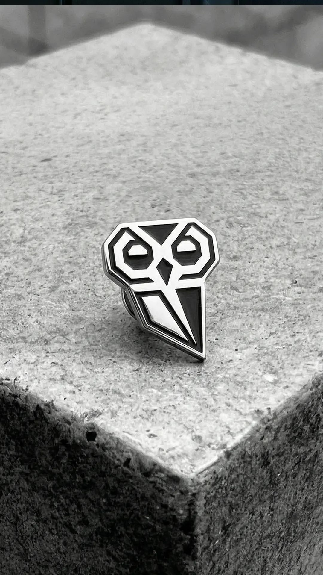
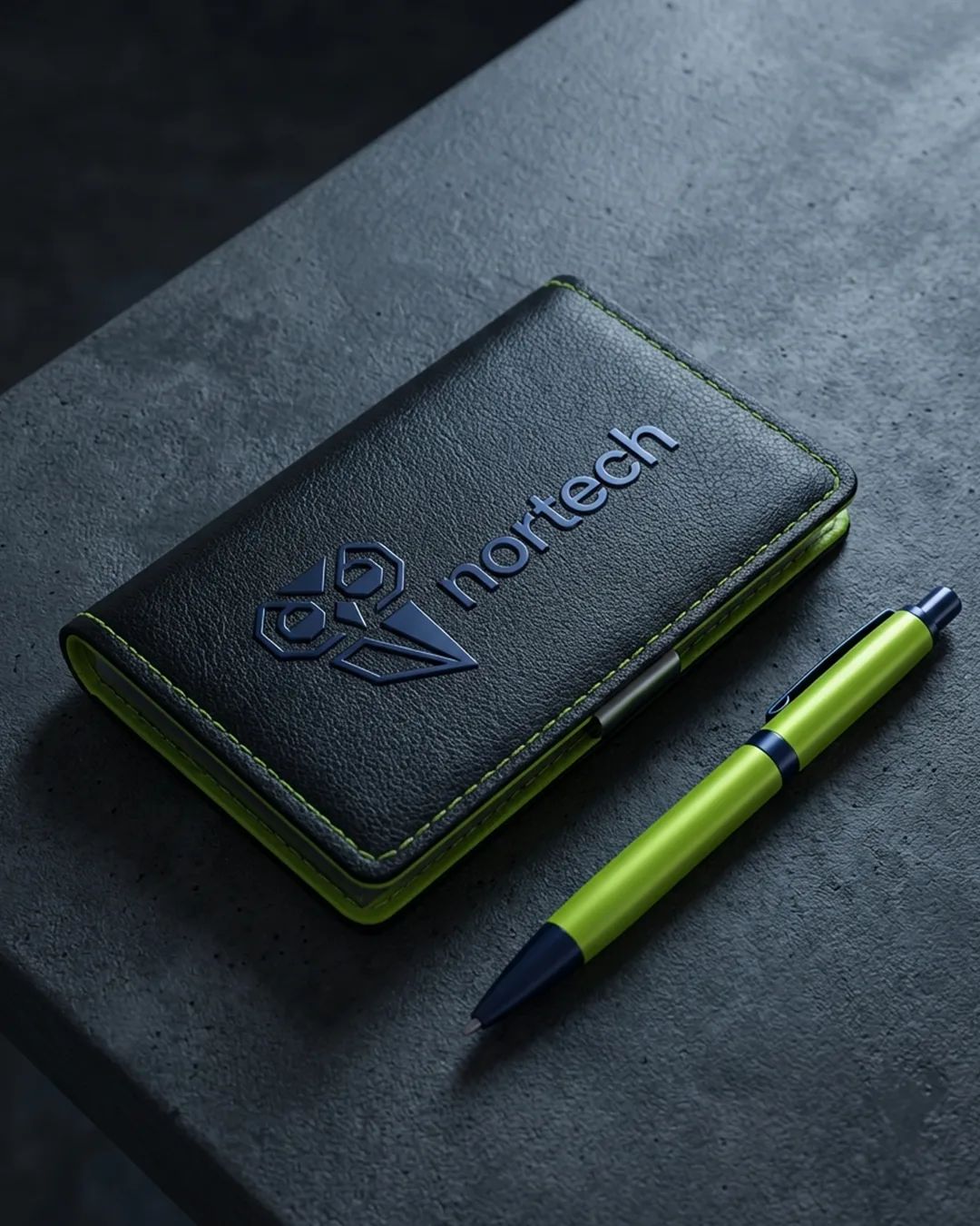
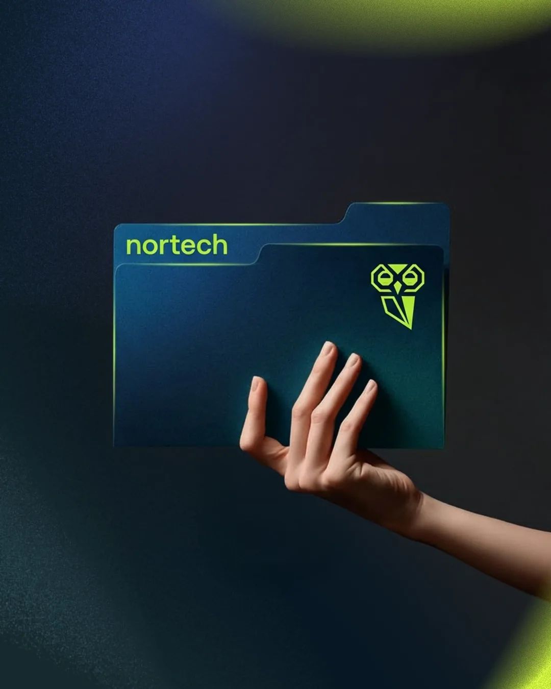
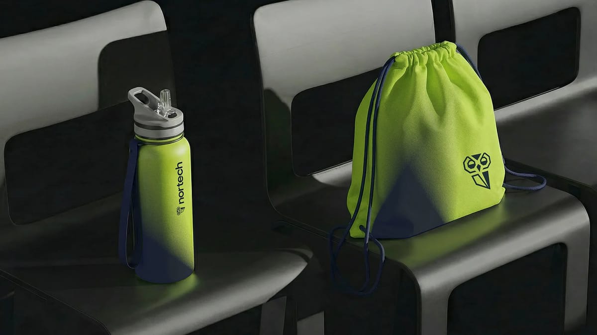
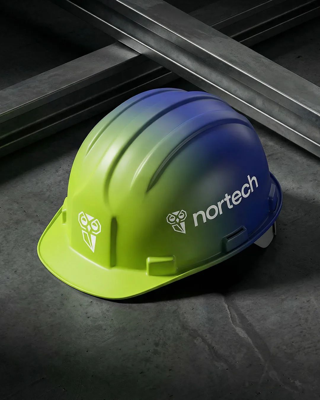
A brand redesign focused on what the existing identity was holding back: scalability, digital performance, and the perception of a pioneering company. The owl icon was simplified with intention — cleaner geometry, better contrast, stronger in small sizes. The wordmark was lightened to feel agile and contemporary. The result is a system built around the archetypes of Innovator and Explorer: precise, confident, always moving forward.
[ 03 — Outcome ]
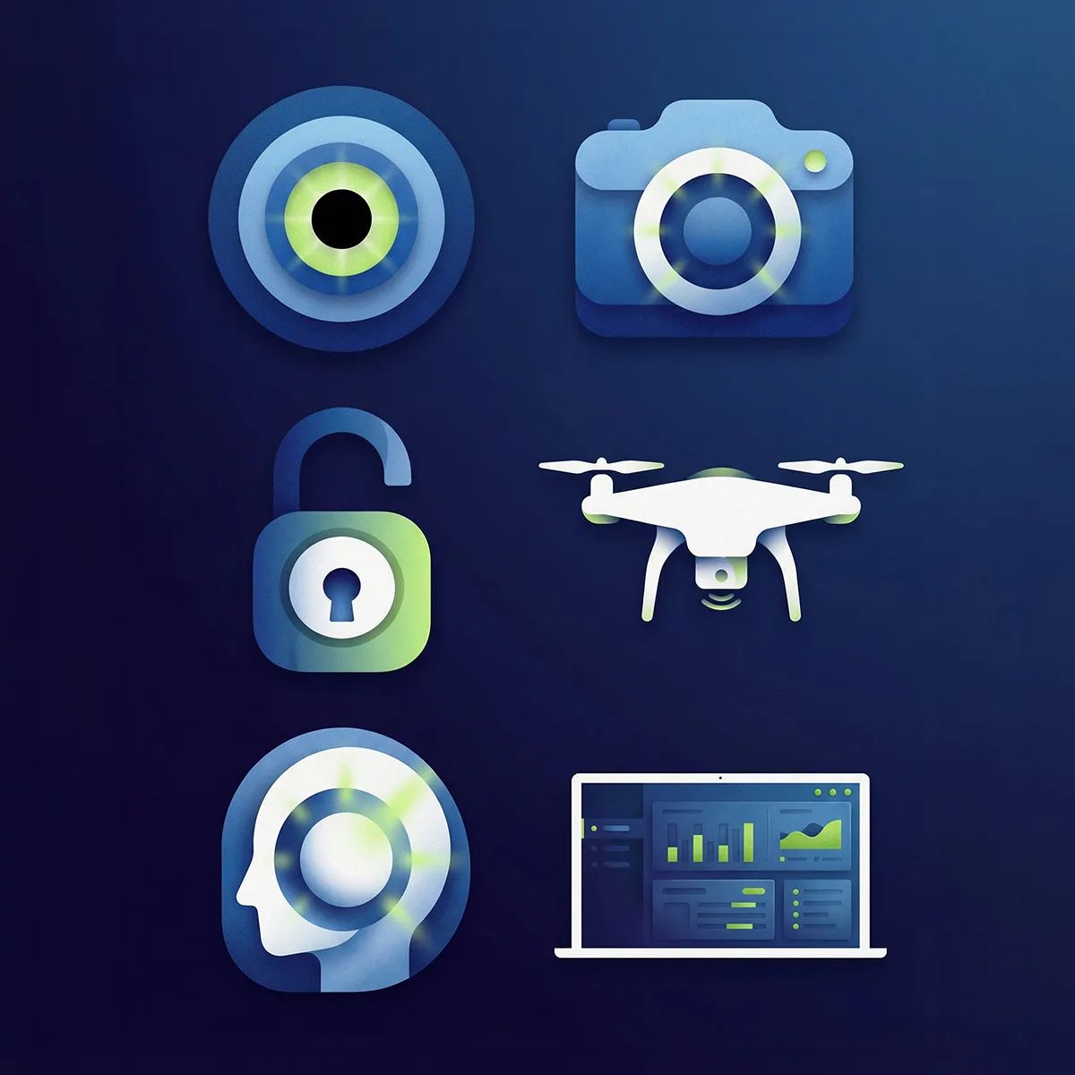
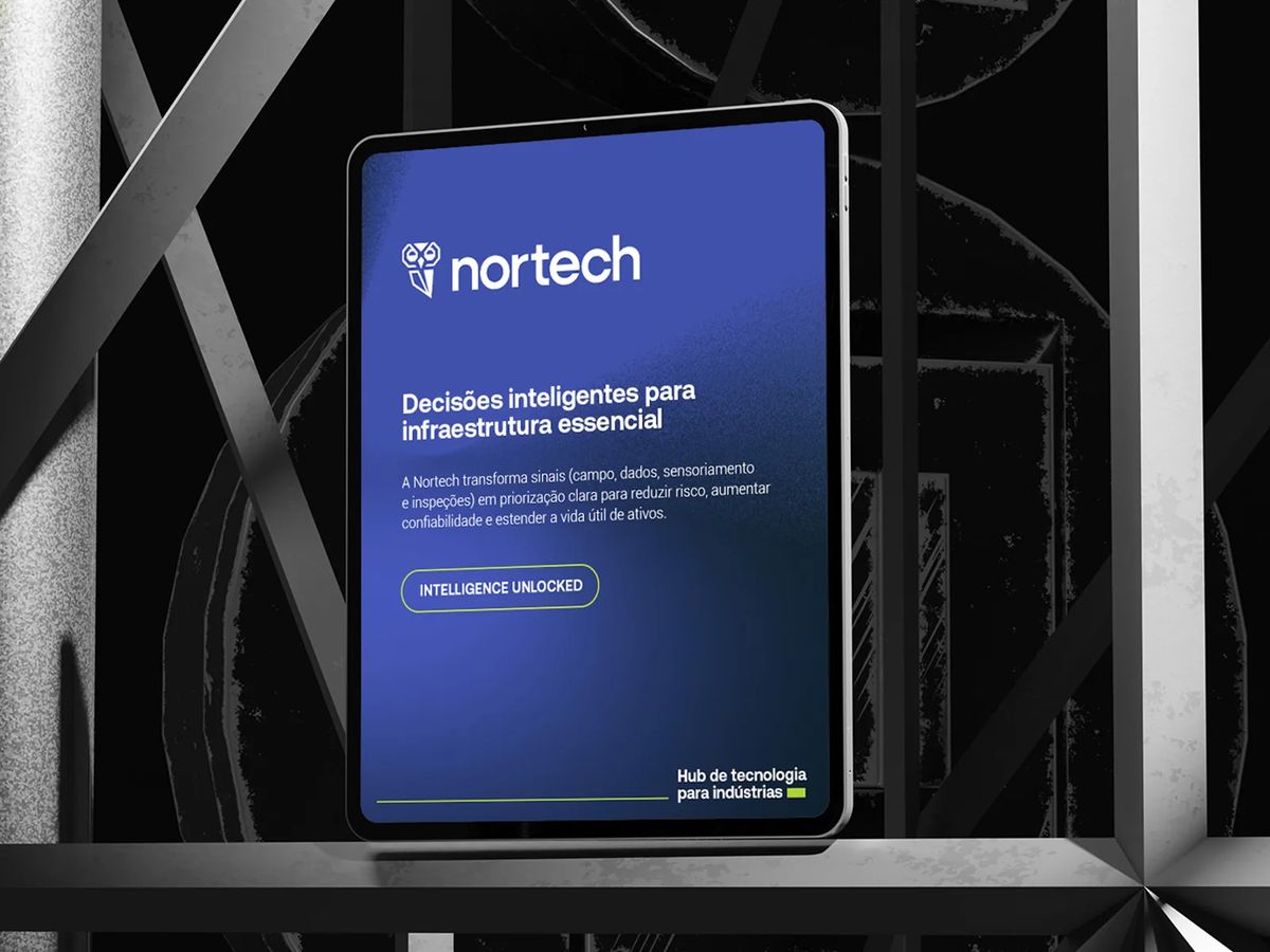
A complete visual identity — redesigned icon and wordmark, color system, brand manual, and collateral. The kind of refresh that earns trust before anyone reads a word. The client noticed it immediately: "The colors and logo they proposed elevated the whole website."