ExamineLab
Client
ExamineLab
Sector
Health
Country
Brazil
Year
2024
Scope
visual identity · verbal identity

[ 01 — Context ]
ExamineLab was still defining what its new brand needed to express. The challenge was to give the laboratory a clear and credible presence—one that could communicate scientific precision, innovation and the care patients should feel at every point of contact.
[ 02 — Approach ]
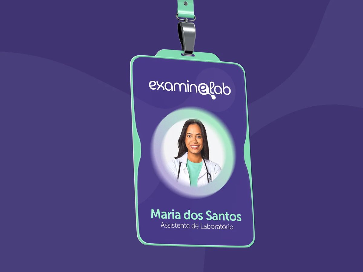
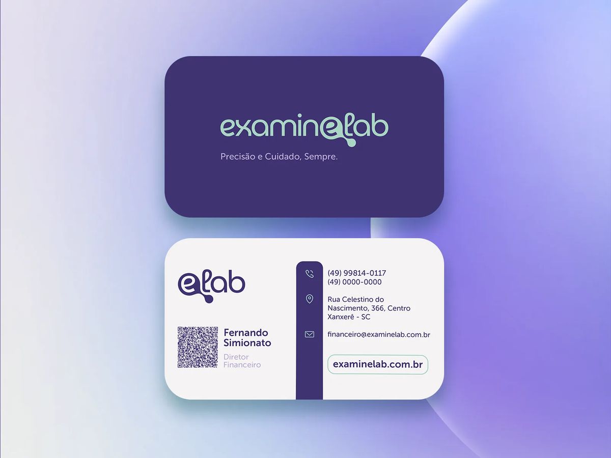
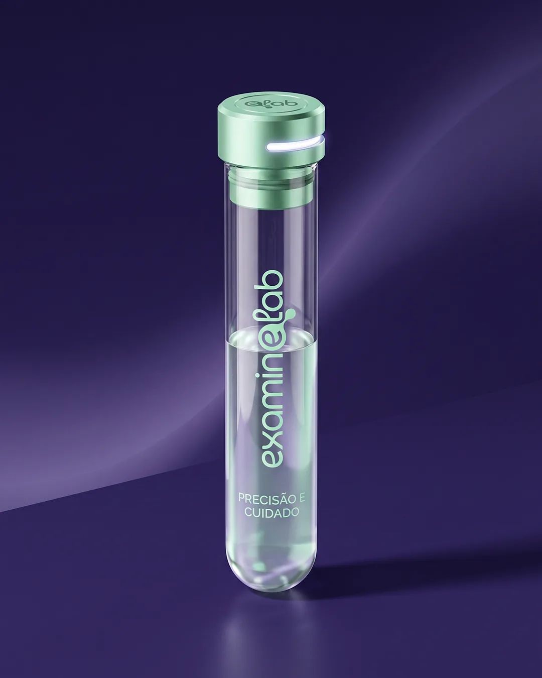
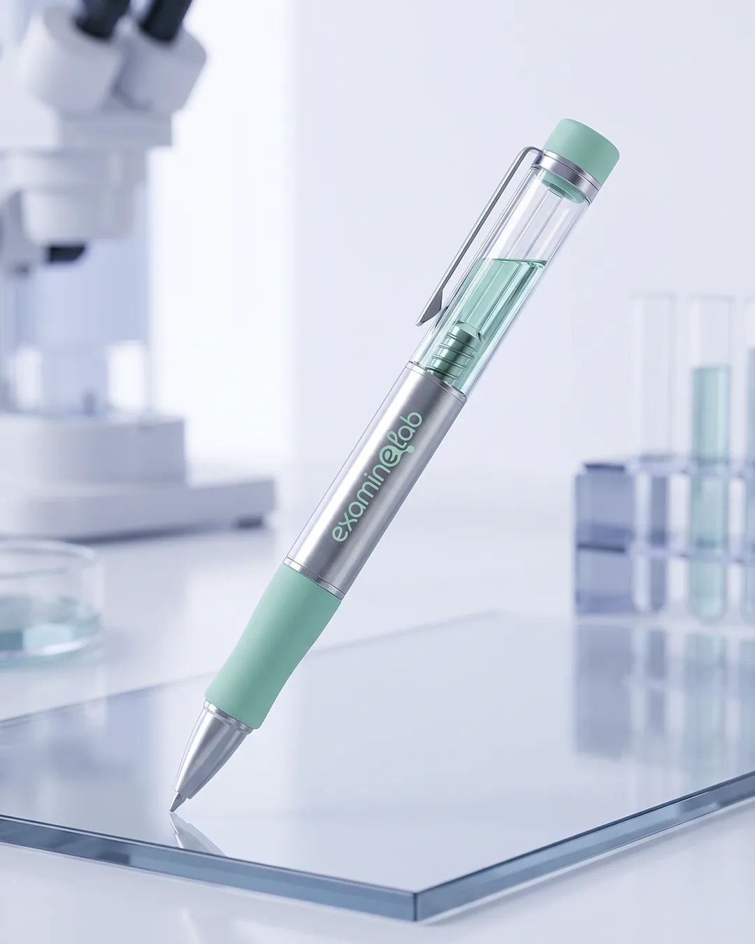
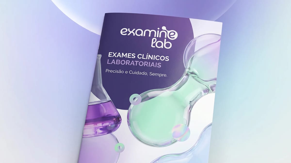
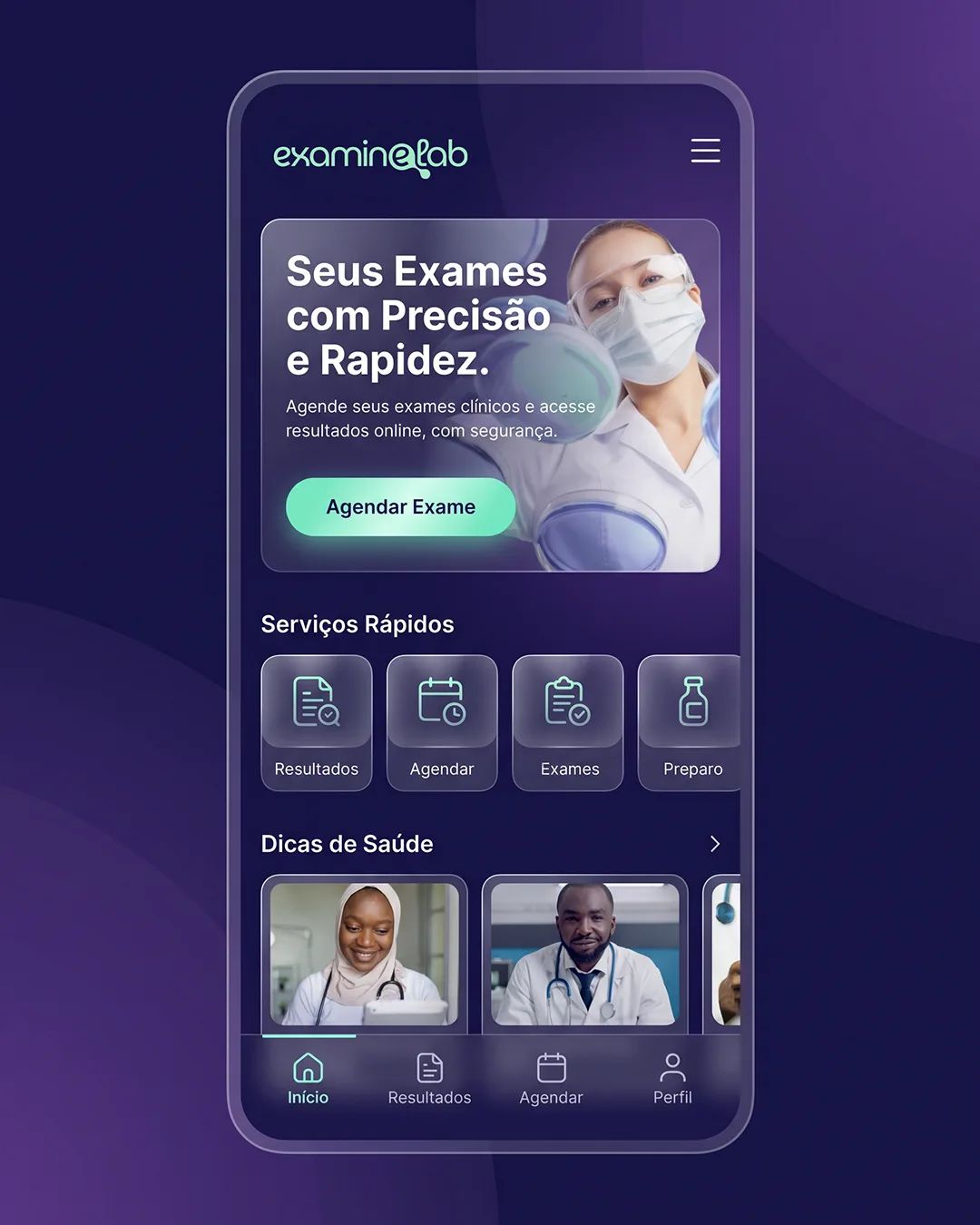
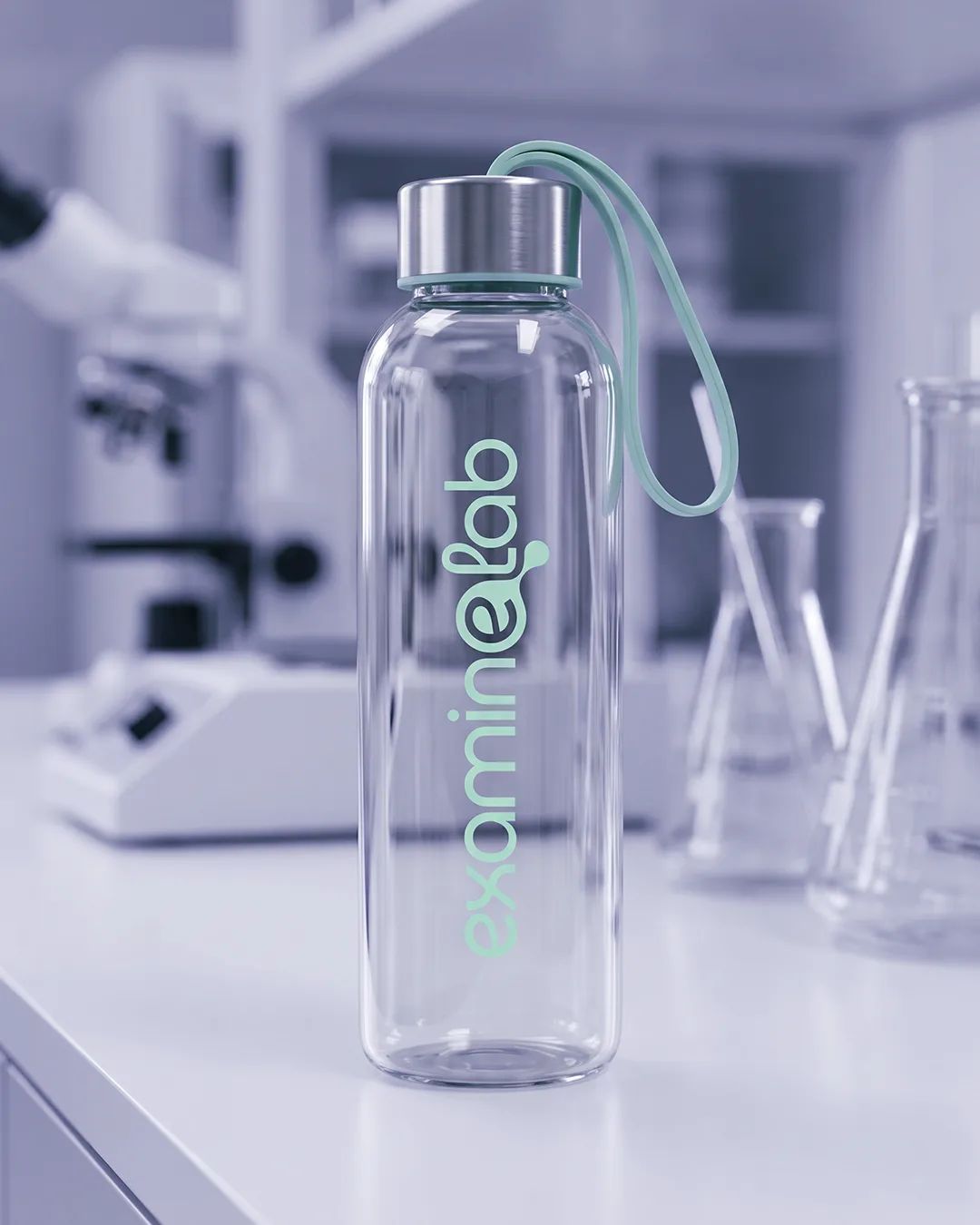
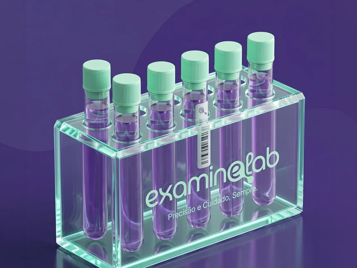
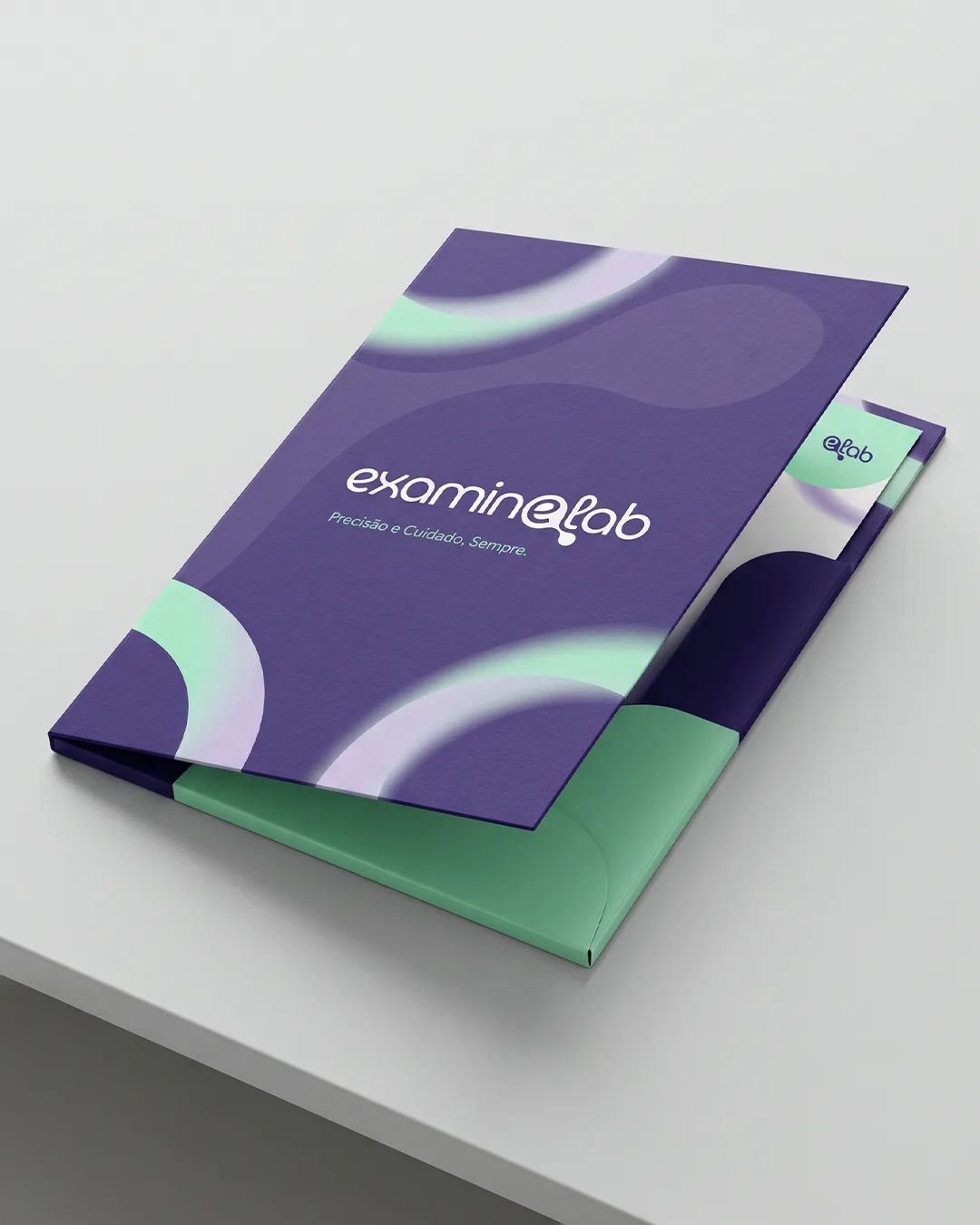
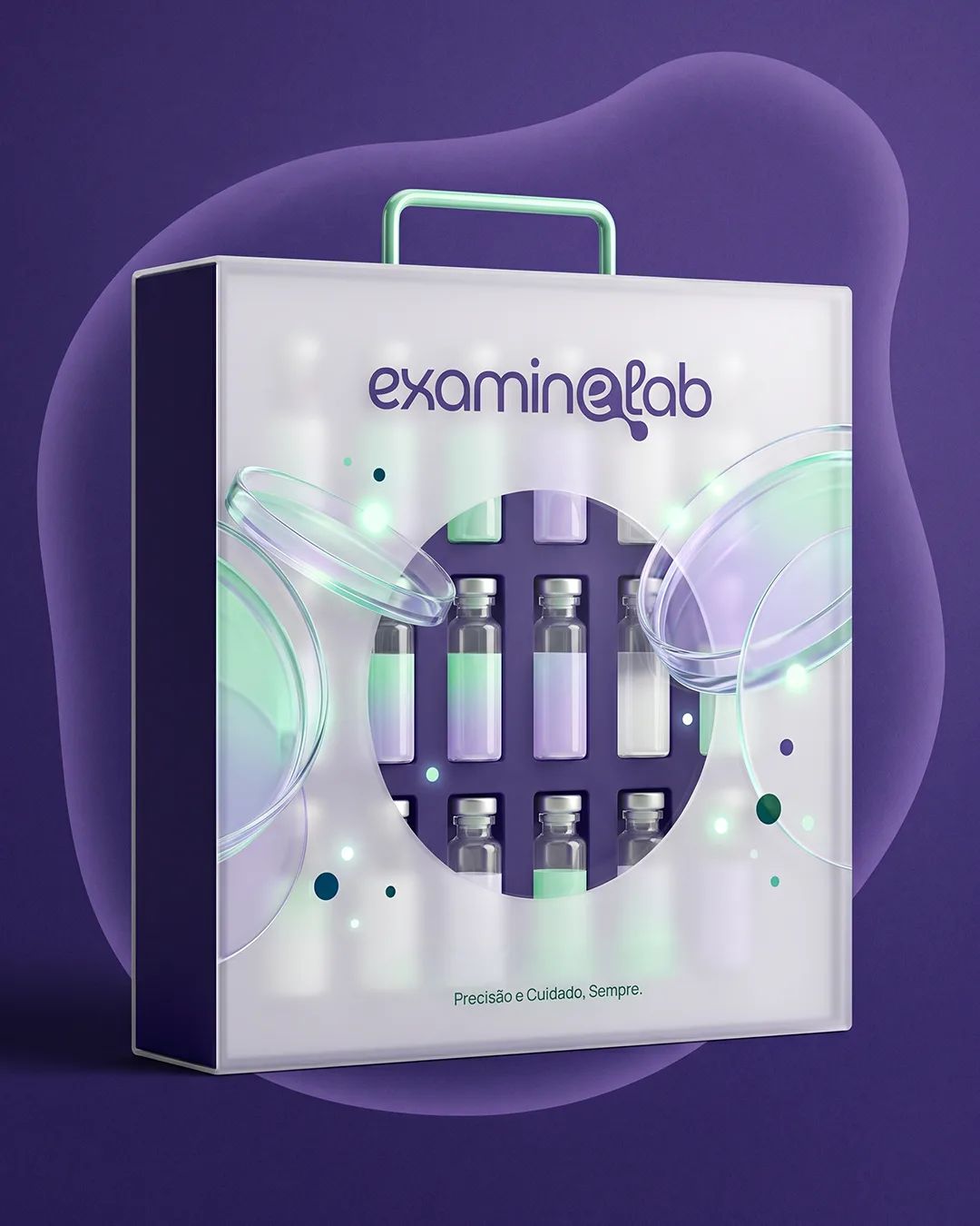
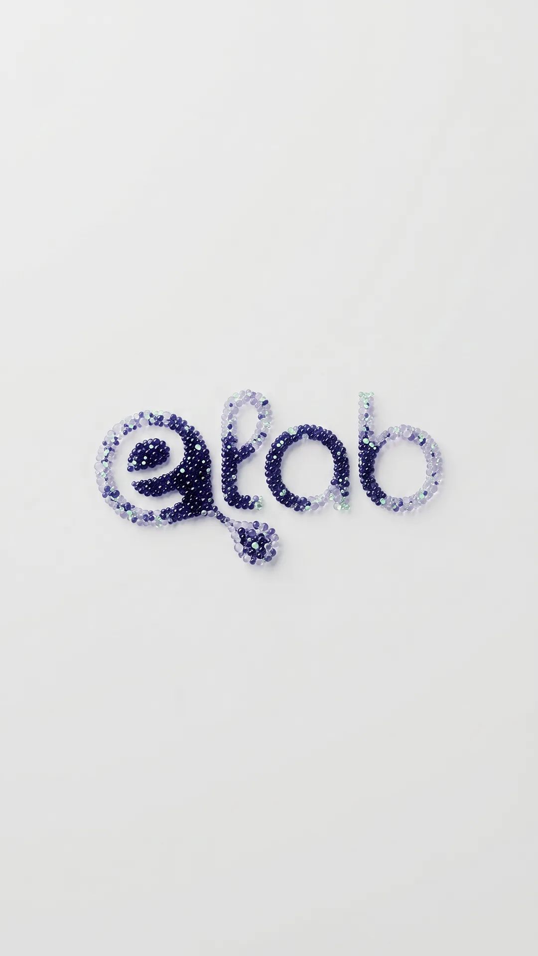
We built the identity around precision, clarity and genuine care. A custom wordmark brings a softer rhythm to the science, while the final “e” becomes a subtle molecule, connecting the name directly to laboratory analysis. The compact eLab symbol carries the same idea into smaller formats, while the broader visual system gives every application a recognizable ExamineLab character.
[ 03 — Outcome ]
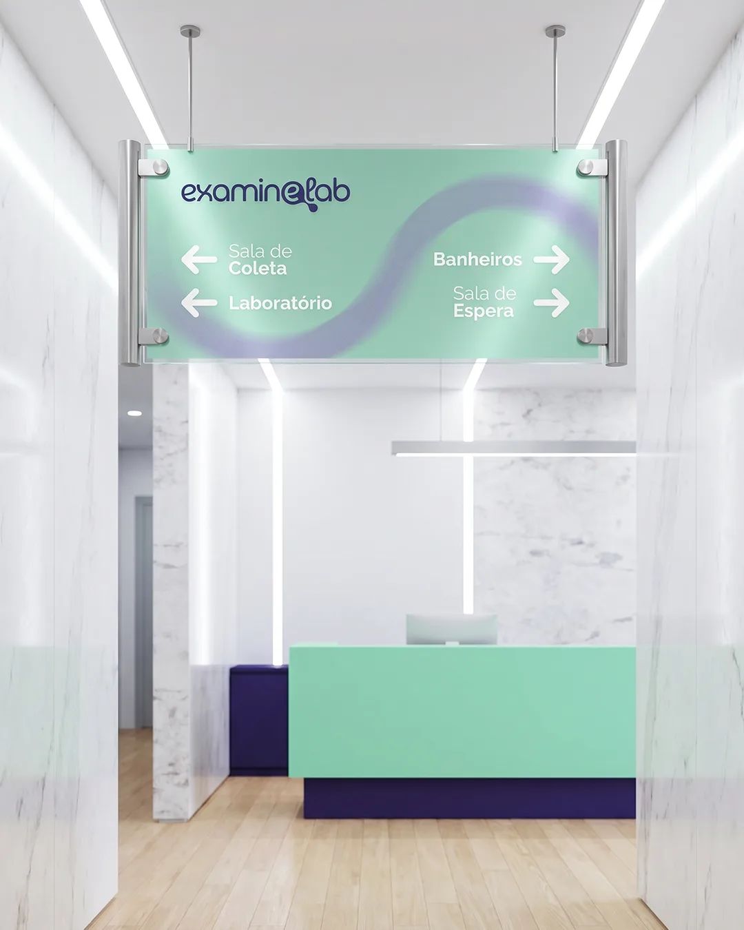
A flexible visual identity designed to work across every scale, from the smallest laboratory item to patient-facing spaces. Clear, modern and expressive, the system gives ExamineLab a consistent presence and a simple promise it can carry forward: precision and care, always.







[ Testimonial ]
Working with Anne was very easy. Her knowledge and the way she led the process made me feel comfortable expressing what I was looking for, and she understood everything very quickly. The result went far beyond what I expected. When we started creating the brand, we were still unsure of what it needed to express; by the end of the project, we knew we were on the right path. It felt as though she could understand my thoughts and translate my ideas and feelings into the work. I highly recommend Anne—her approach is truly distinctive.
Fernando Simionato
· ExamineLab