Falke
Client
Falke
Sector
Construction
Country
Brazil
Year
2018
Scope
Brand Naming · Brand Identity
[ 01 — Context ]
A construction products brand needed a name that could carry the weight of the industry — robustness, durability, resilience — without sounding like every other player in the space.
[ 02 — Approach ]
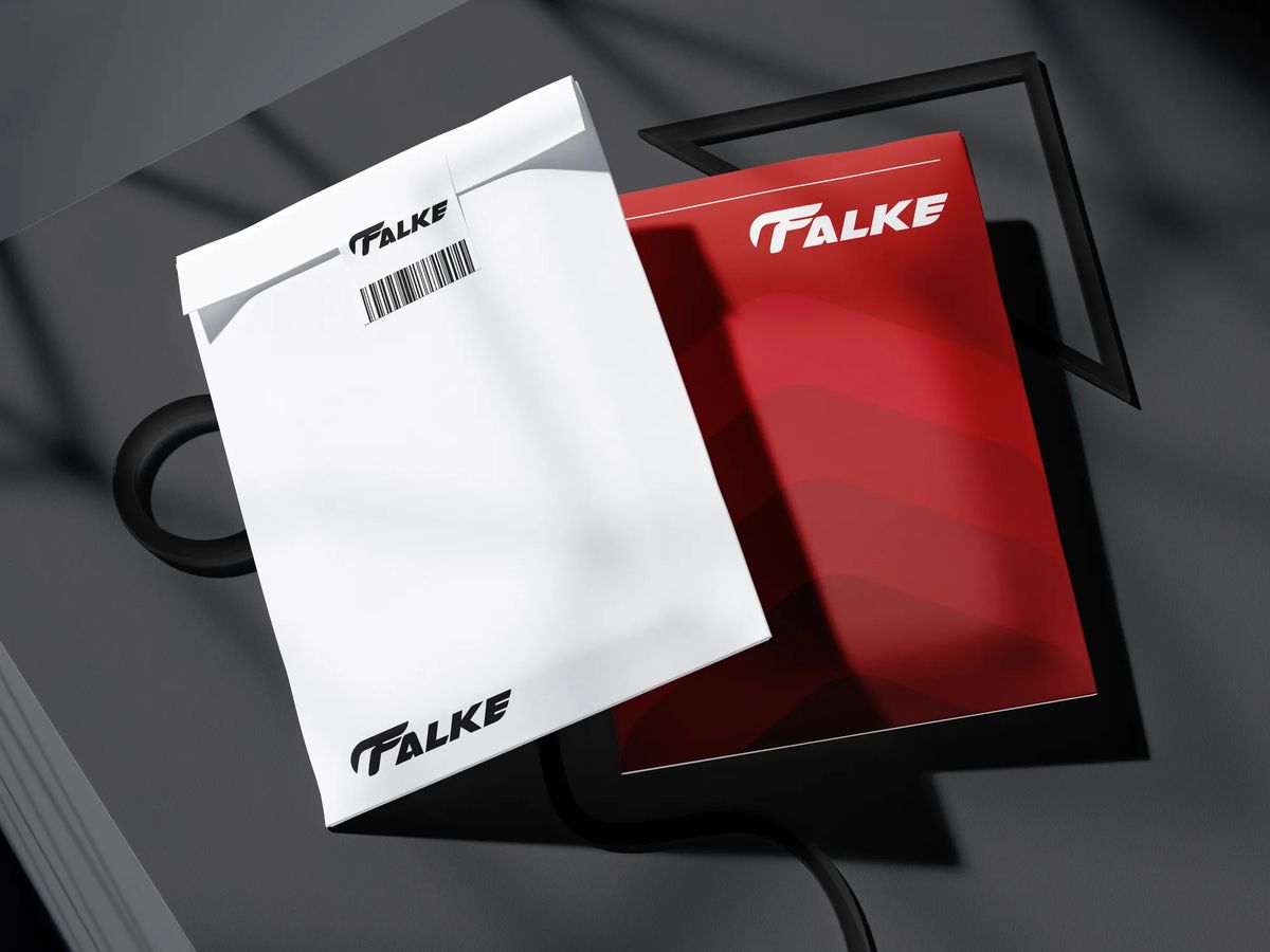
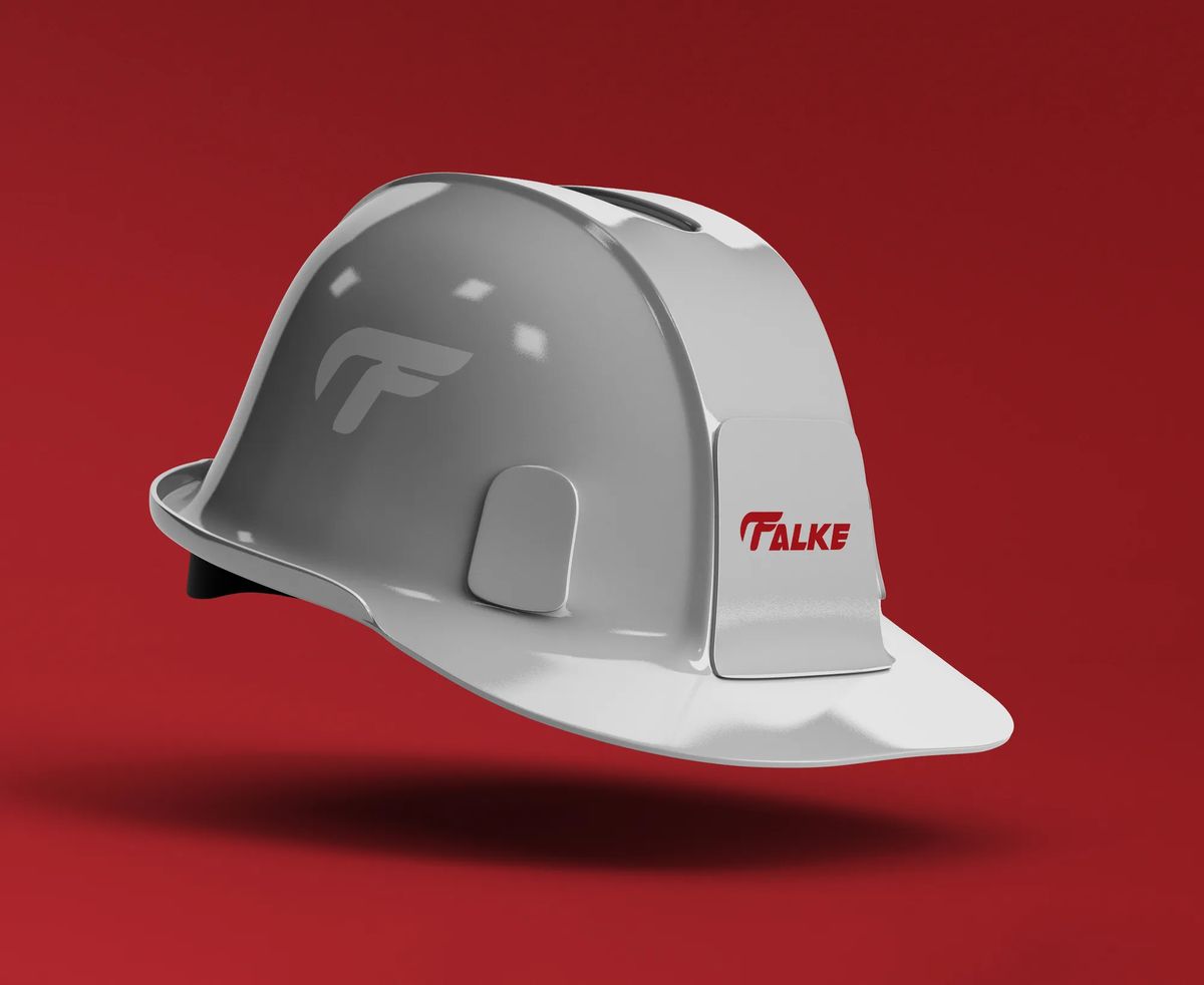
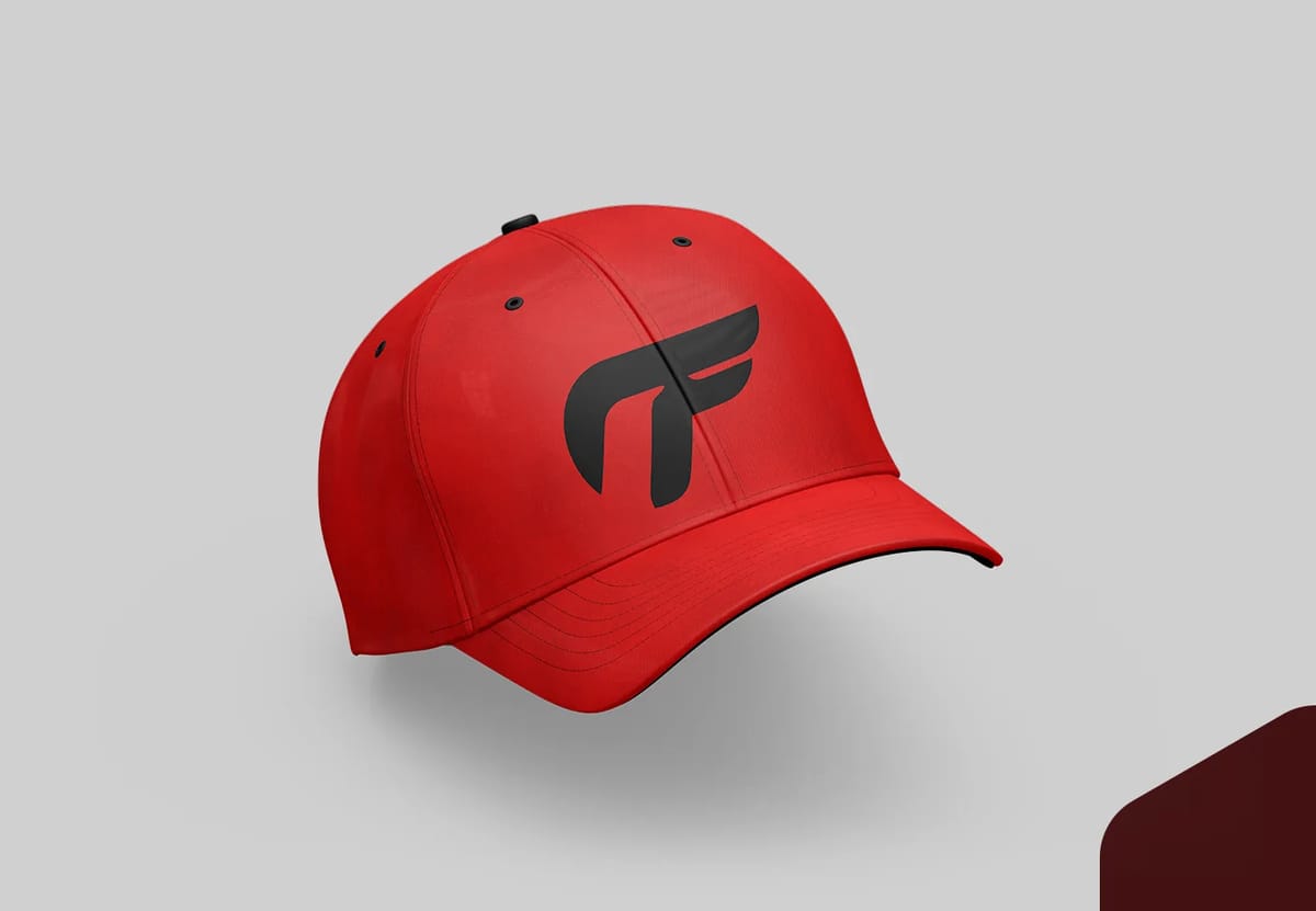
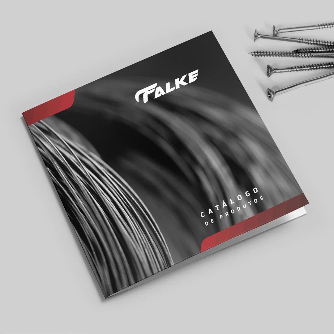
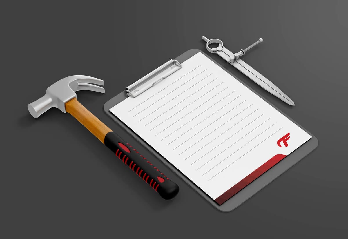
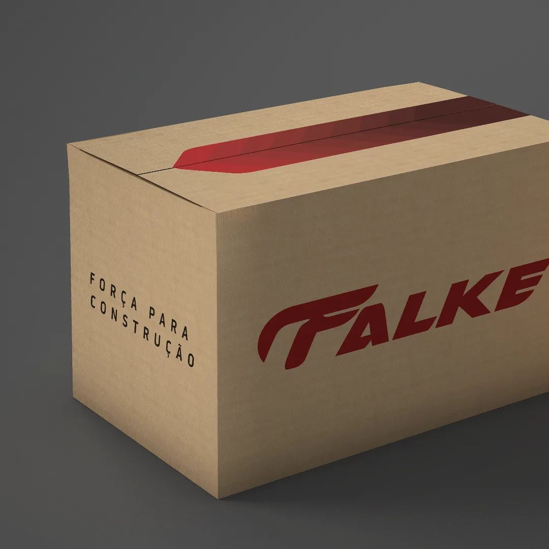
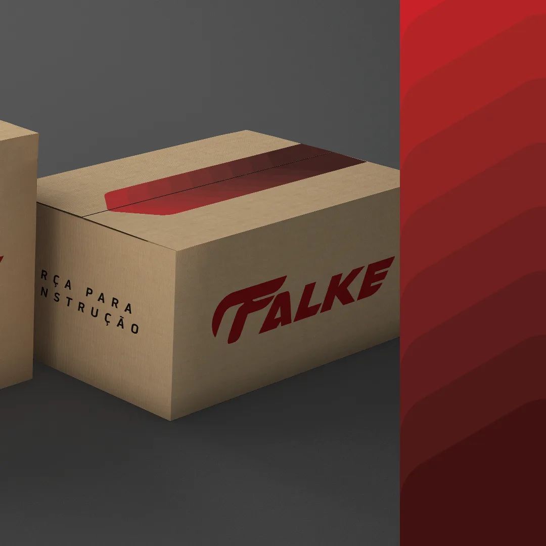
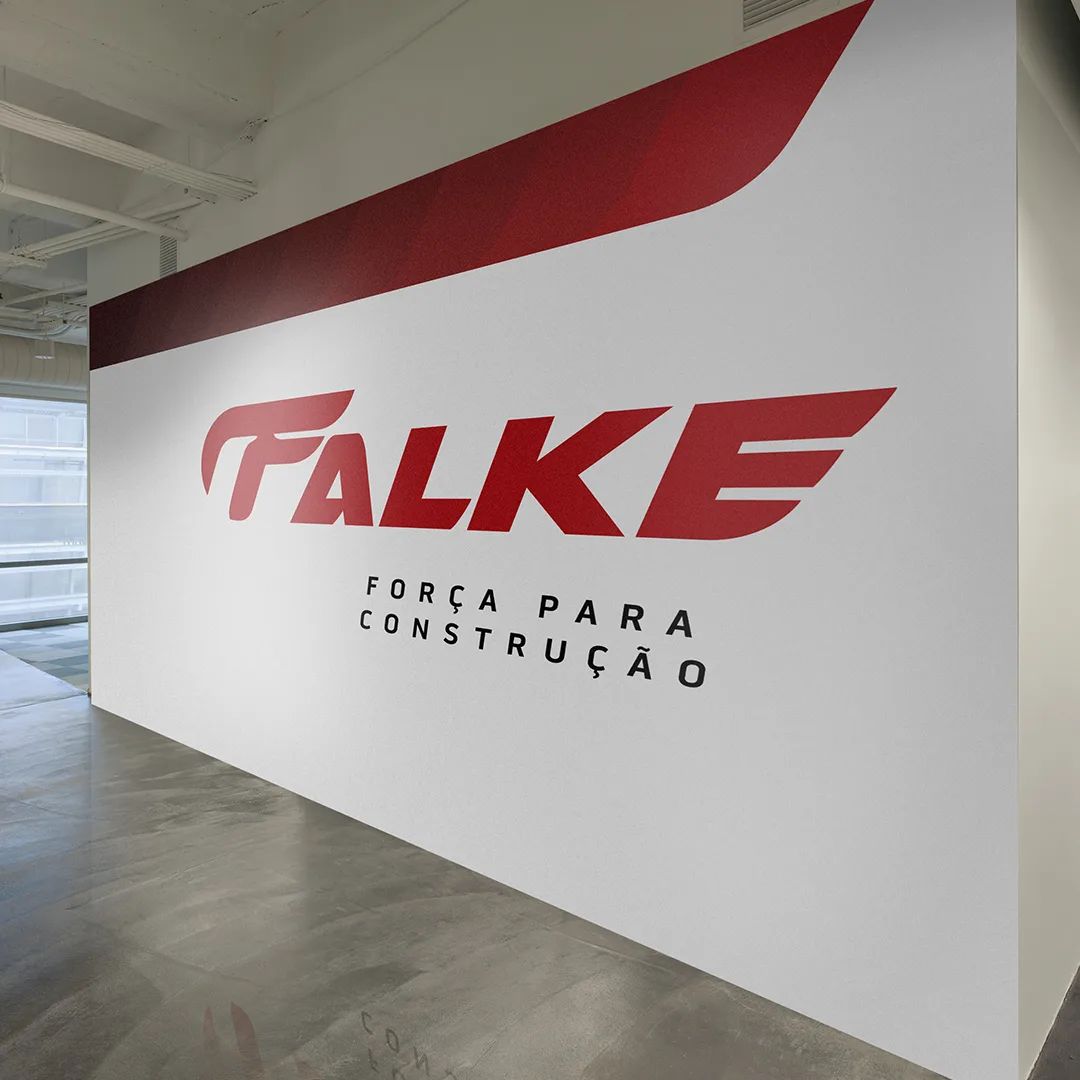
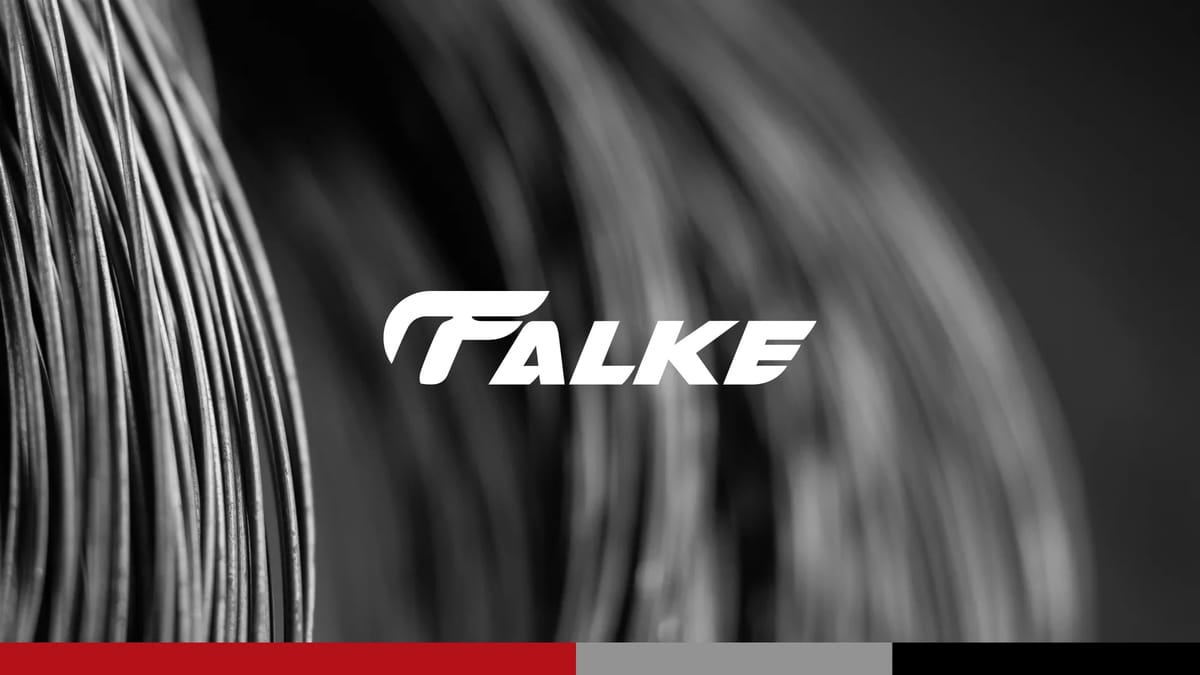
The name came from German: Falke, meaning falcon. A bird that embodies physical strength, sharp instinct, and the ability to adapt fast — exactly what a construction brand needs to project. The visual identity followed the same logic: bold, monochromatic, built to stand out on a construction site where everything else is competing for attention.
[ 03 — Outcome ]
Naming and a full visual identity system designed to perform in the field — from packaging to signage — as confidently as the name itself.