Origem
Client
Origem
Sector
Home Decor and Fashion
Country
USA
Year
2022
Scope
Brand Naming · Brand Identity
[ 01 — Context ]
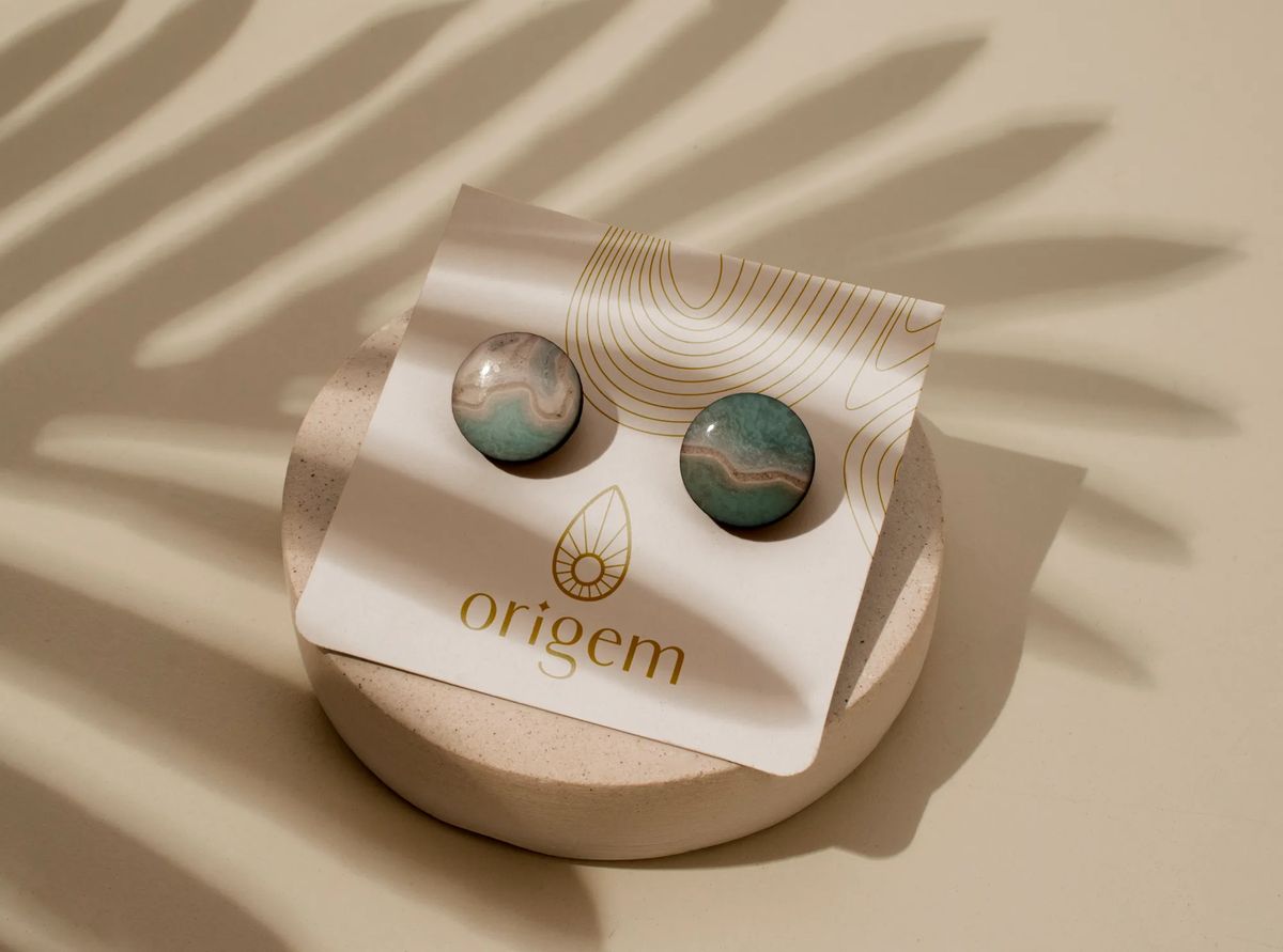
A client dealing in rare, handpicked gemstones needed a brand that could reflect that exclusivity. Each stone is one-of-a-kind — never the same color or pattern twice.
[ 02 — Approach ]
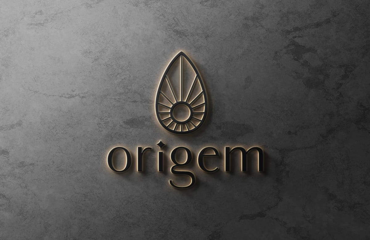
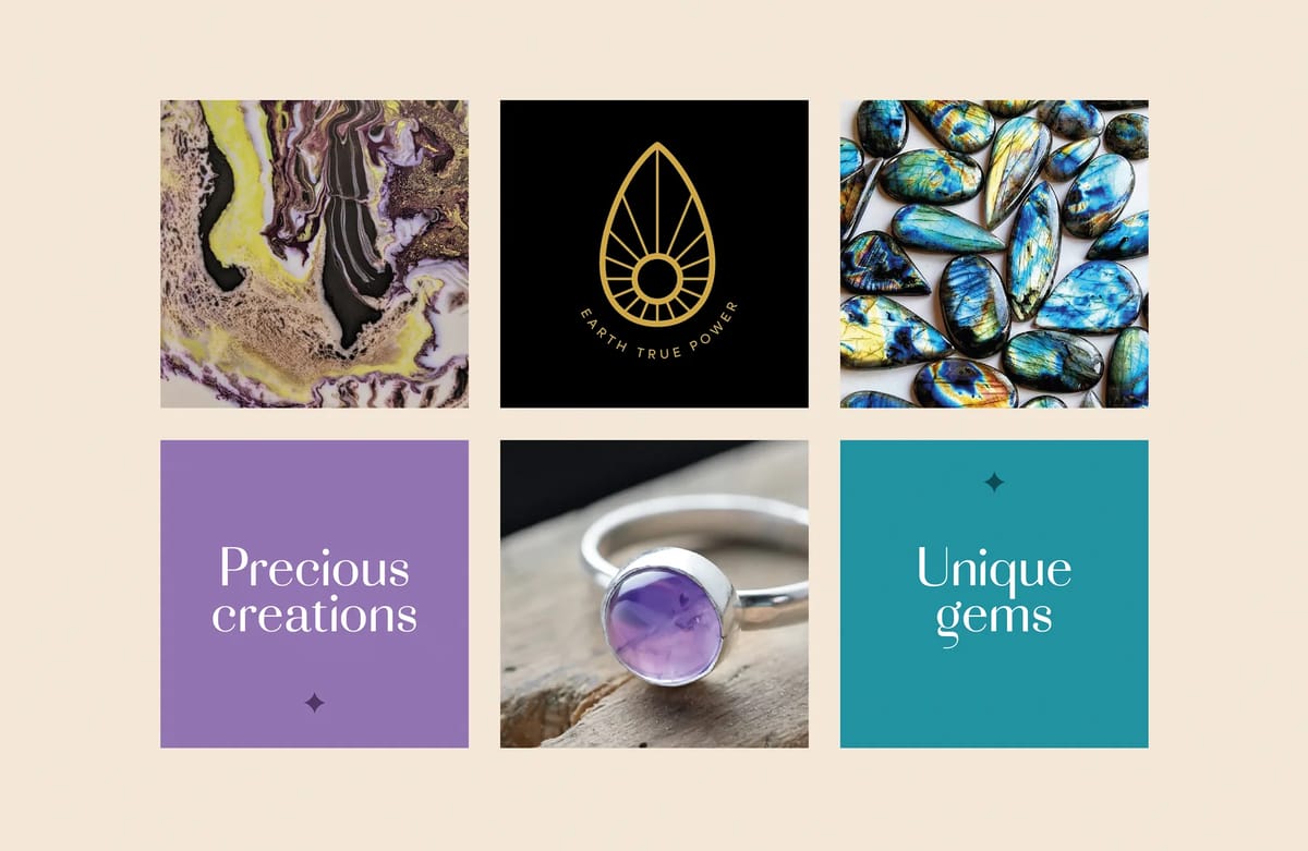
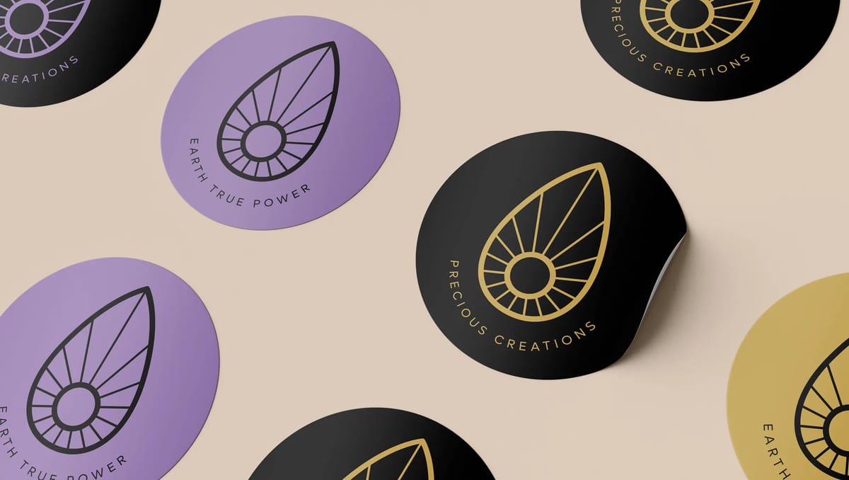
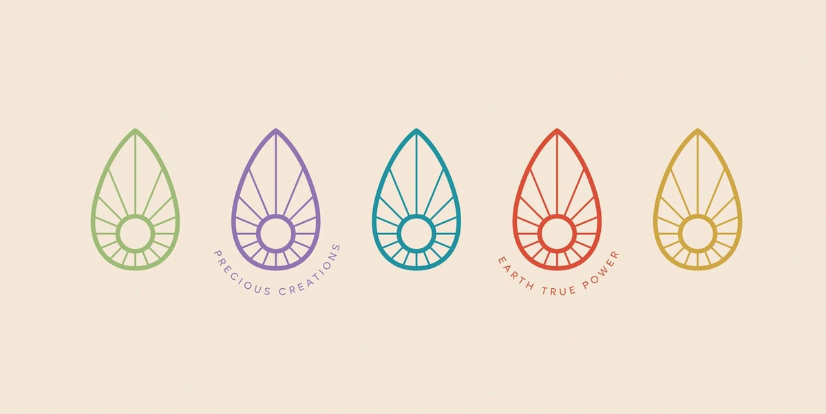
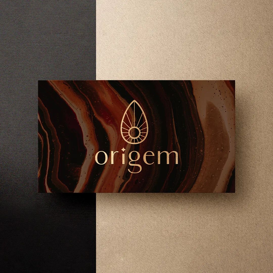
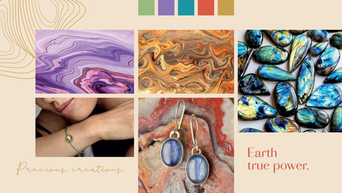
Brand naming was the foundation. Origem combines "origin" and "gemstone" into a single, internationally legible word. The visual system was built around that same idea — a stone-shaped icon with a radiating sun, five saturated colors drawn from nature, and typography that walks the line between raw and refined.
[ 03 — Outcome ]
A full brand identity that remind the audience about the strength of the history and traditions behind its products. The slogans Earth True Power and Precious Creations do the heavy lifting in messaging. Everything pointed back to authenticity and rarity.

[ Testimonial ]
It was really amazing how they captured my ideas and vision so quickly. From the bold and international name, to the visual concepts and identity, everything just makes sense and it was much easier for me to understand and define my own brand. It was my first experience with an agency and I loved it.
Hakan Akkurt
Client · Origem