Fit Bliss
Client
Fit Bliss
Sector
Food
Country
Australia
Year
2020
Scope
Brand Identity · Packaging
[ 01 — Context ]
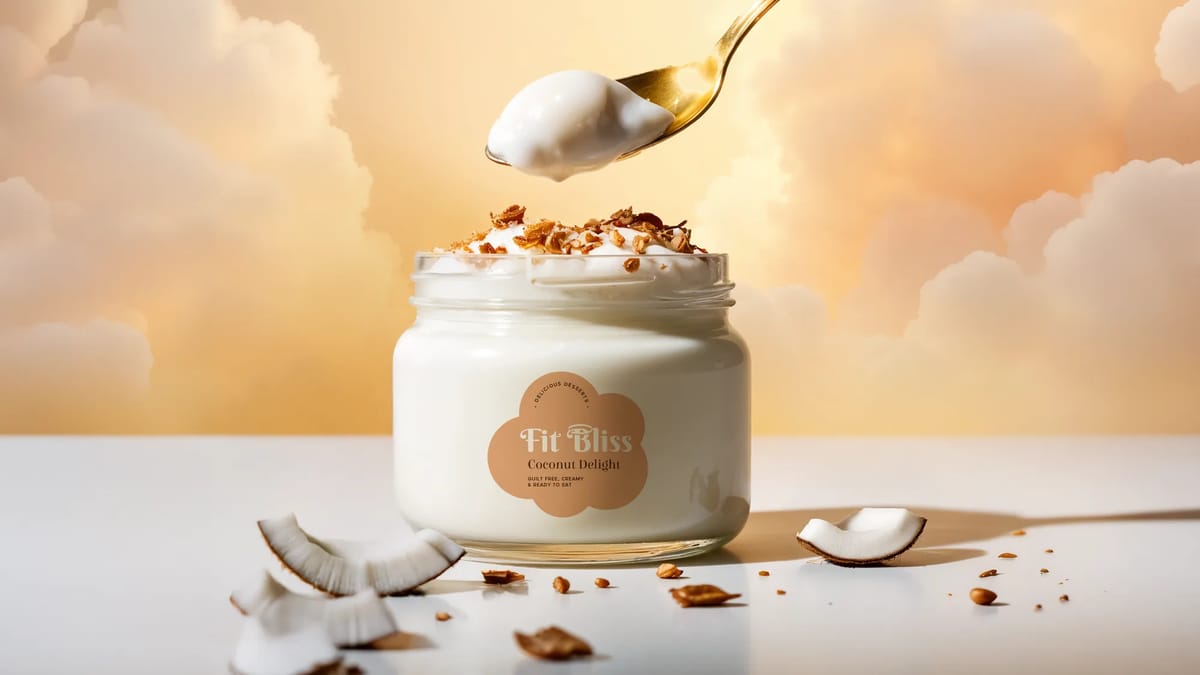
Fit Bliss is a guilt-free dessert brand — the kind of indulgence that doesn't ask you to choose between feeling good and eating well. The challenge: make it feel heavenly without losing the "fit" part of the promise.
[ 02 — Approach ]
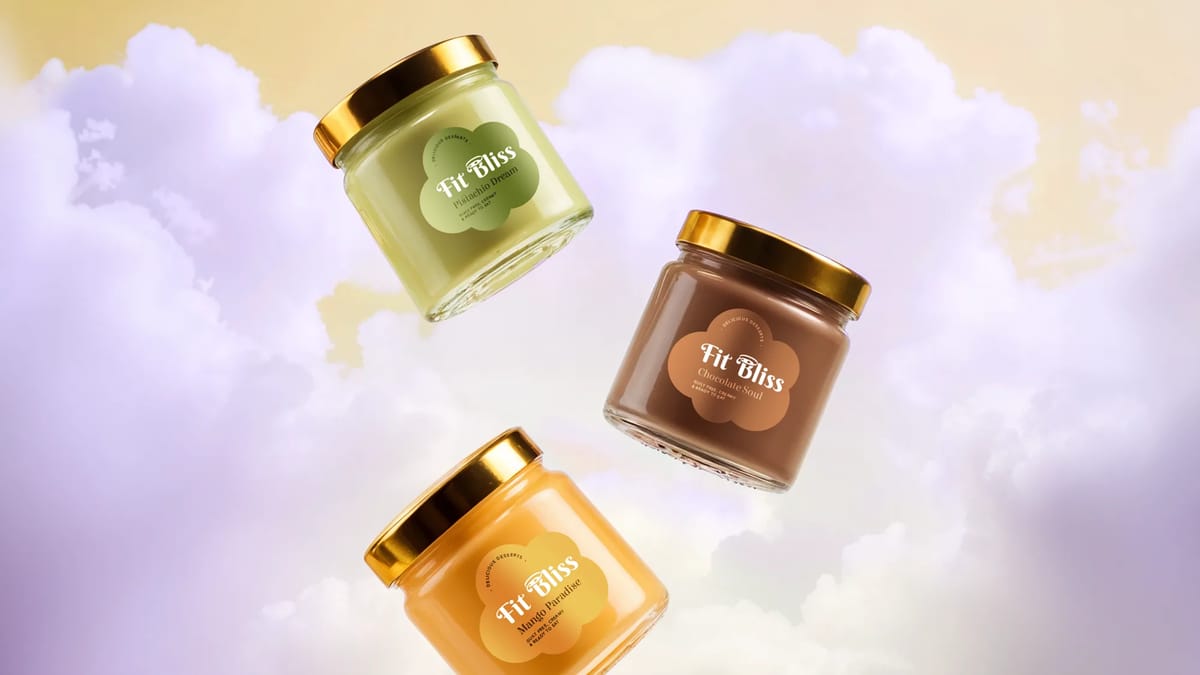
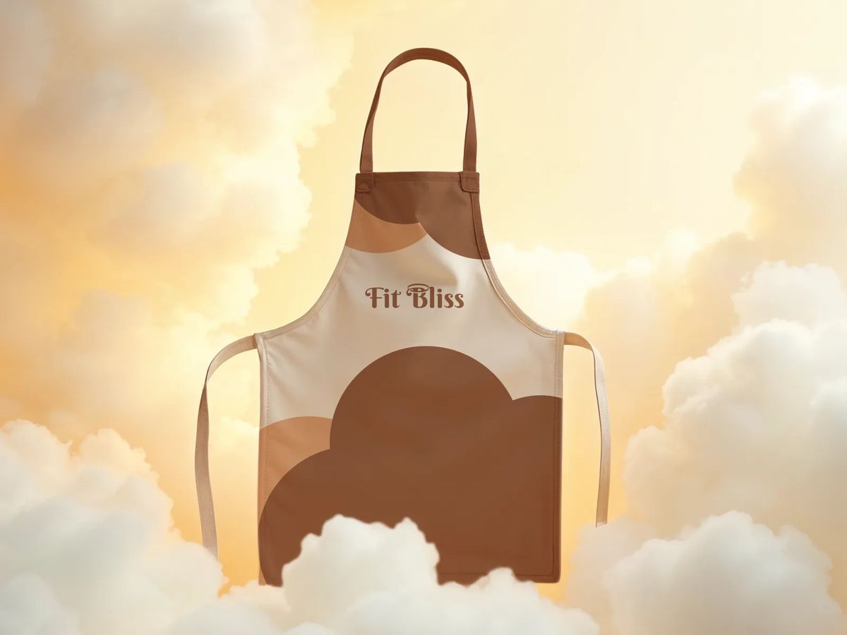
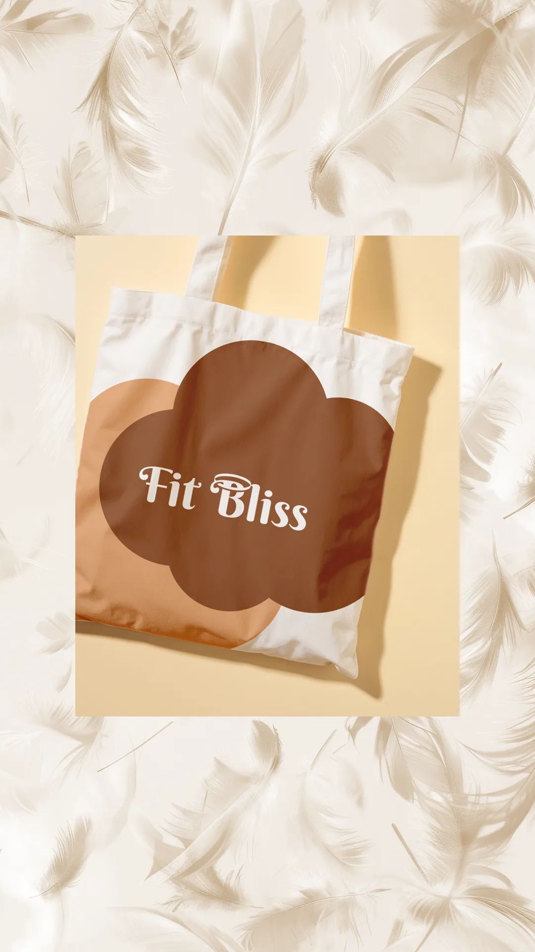
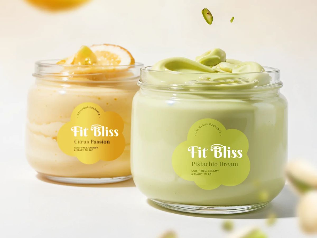
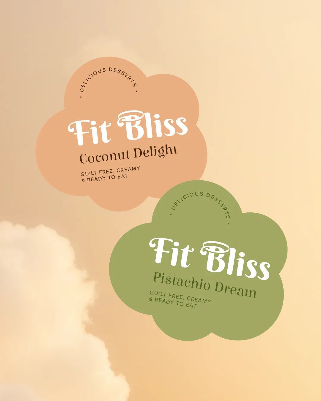
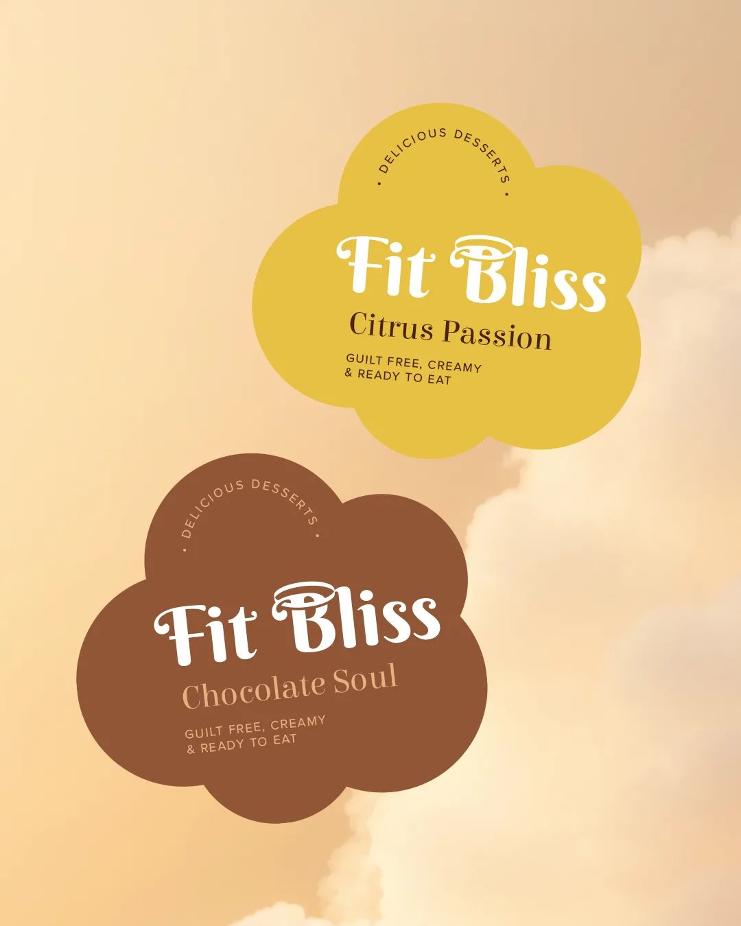
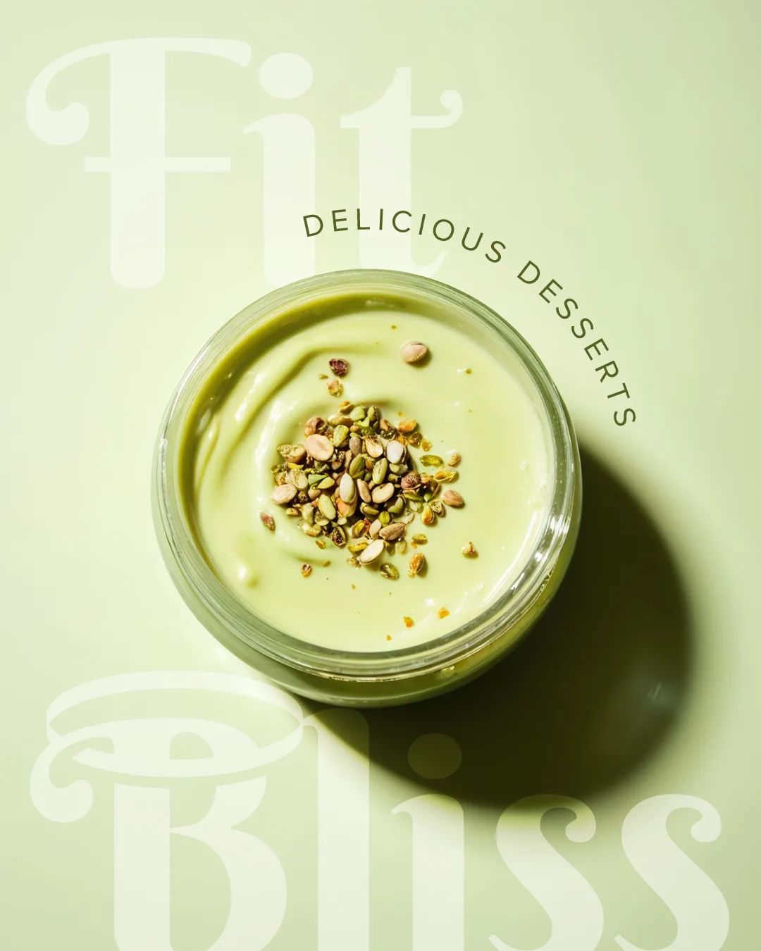
The identity leans into that tension rather than smoothing it over. The cloud-shaped label became the brand's signature: soft and dreamy. Each flavor gets its own color within that same shape, so the line feels cohesive while every jar still has its own personality. The wordmark is a single flowing script, with one detail that says everything: a small halo sitting above the "B" in Bliss — a quiet nod to the heavenly indulgence the brand promises.
[ 03 — Outcome ]
A brand identity and packaging system where every detail was designed to feel as good as the product tastes. The client's words: "The result was impeccable and much better than I could imagine."

[ Testimonial ]
Mellow is an exceptional team. Always bringing innovative and creative ideas. The result was impeccable and much better than I could imagine. I can only thank their quality and professionalism.
Gabrielle Krieger
Client · Fit Bliss