[ 01 — Context ]
Netwarden is a network monitoring product built for non-specialists — people who need visibility and control without having to speak the language of IT. The challenge was creating an identity for a technical product that could feel approachable and modern without losing credibility.
[ 02 — Approach ]
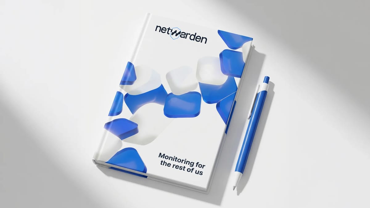
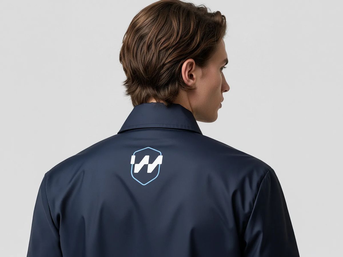
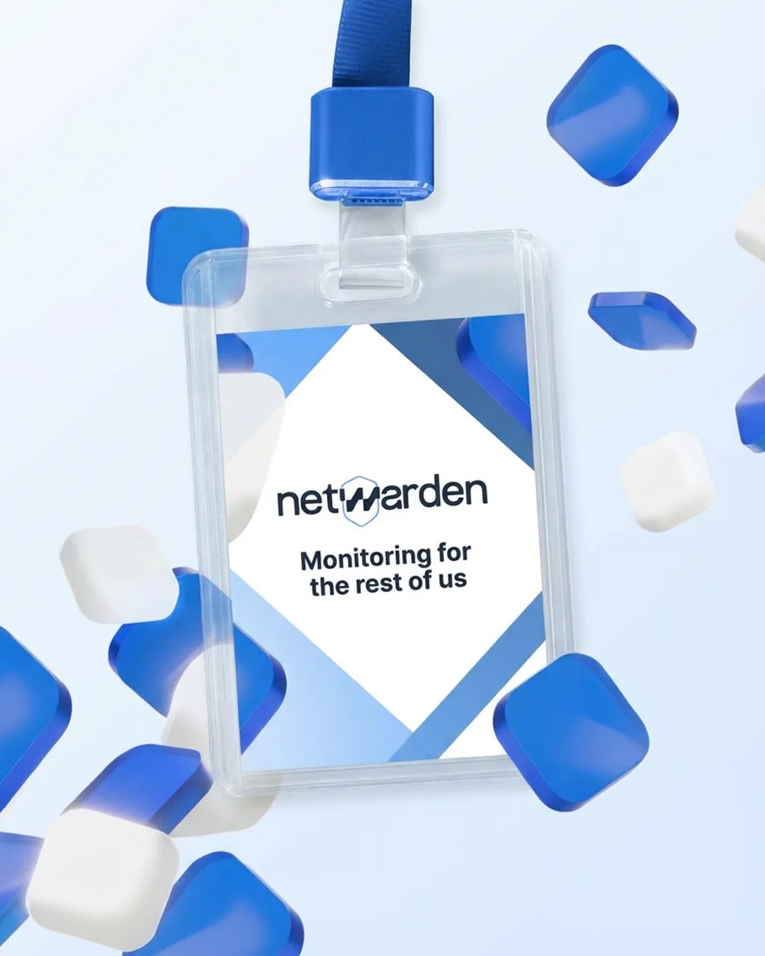
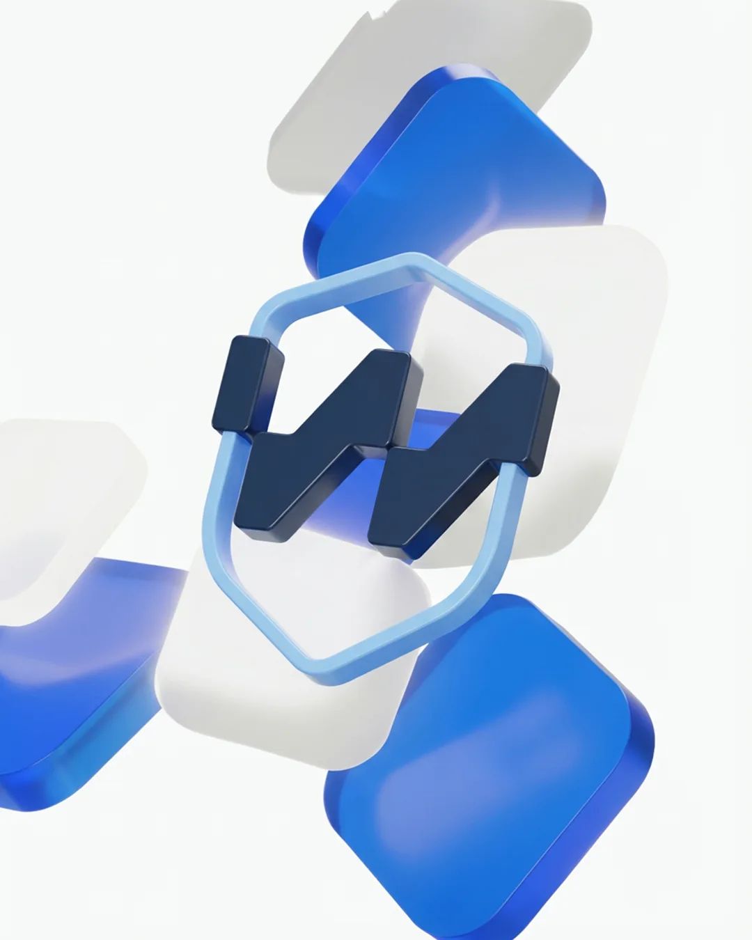
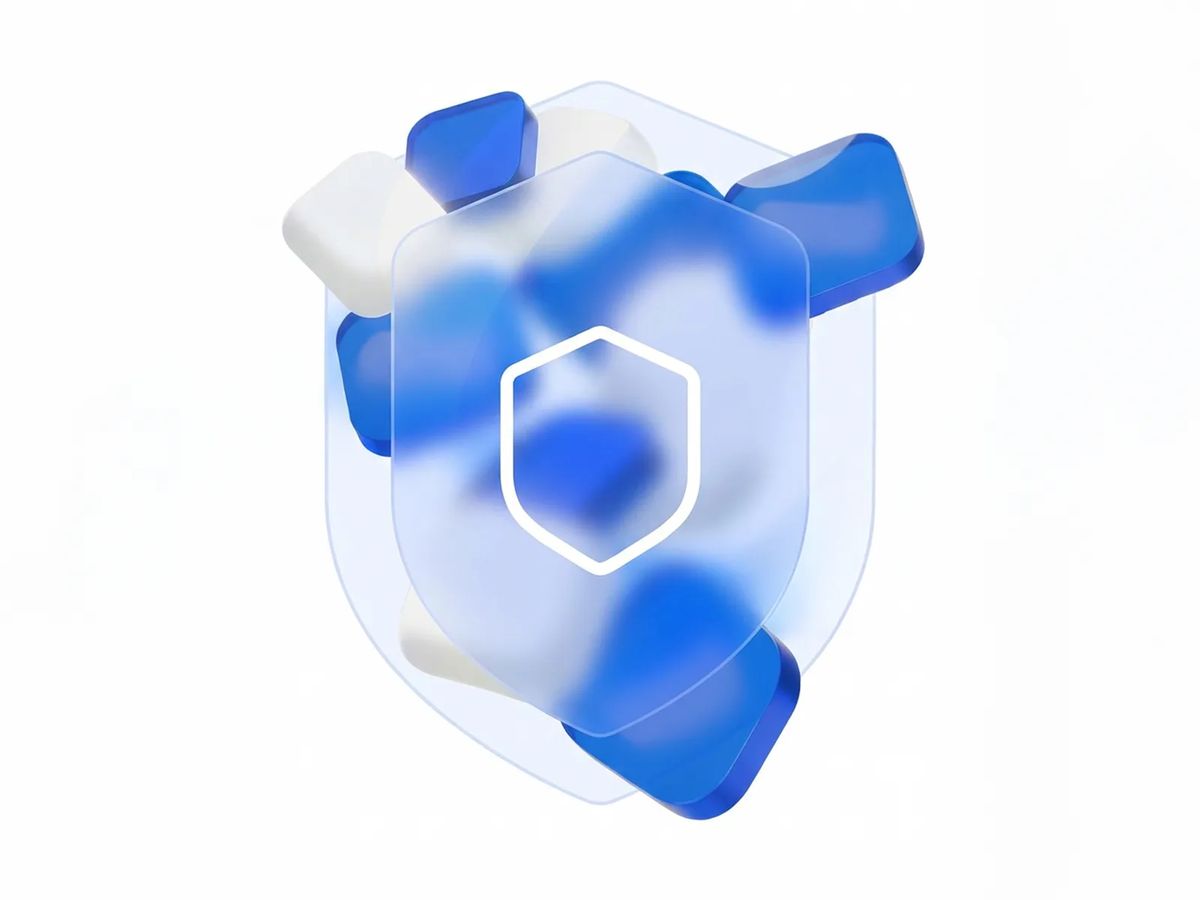
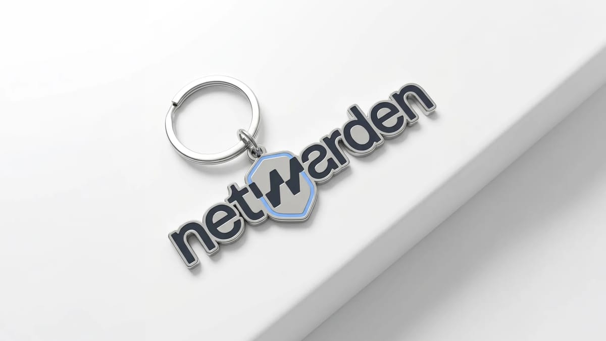
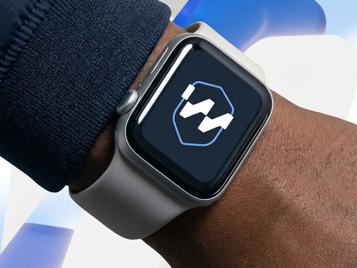
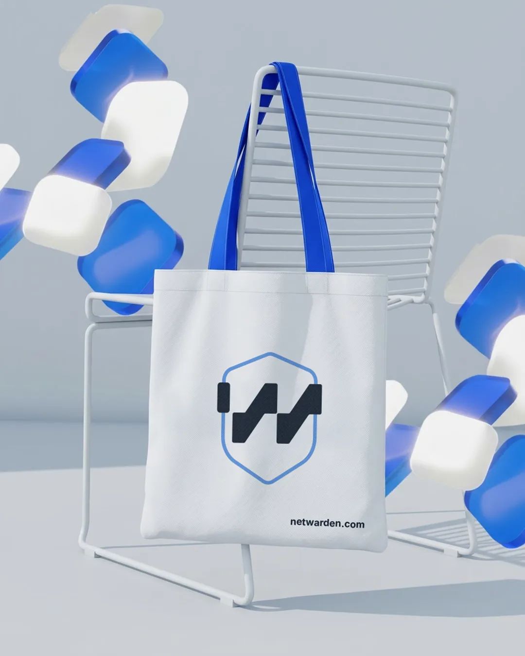
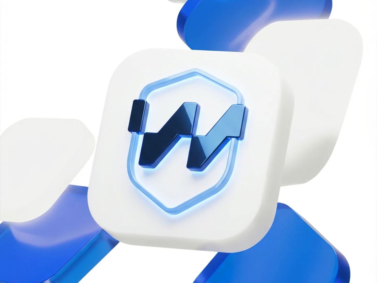
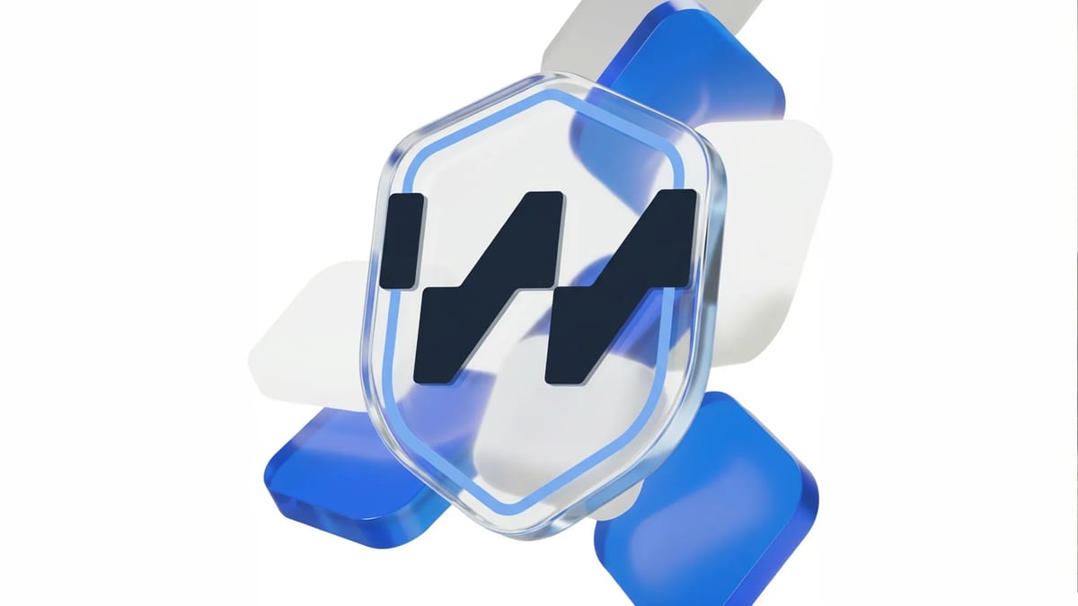
The icon combines a W with a signal/waveform shape inside a hexagonal shield — protection and data flow read simultaneously in a single mark. The wordmark is set in a rounded sans-serif, keeping the tone accessible rather than corporate. Floating soft 3D shapes in a blue-to-white palette run throughout the system, reinforcing the idea of modular, moving data without making the brand feel cold or closed off.
[ 03 — Outcome ]
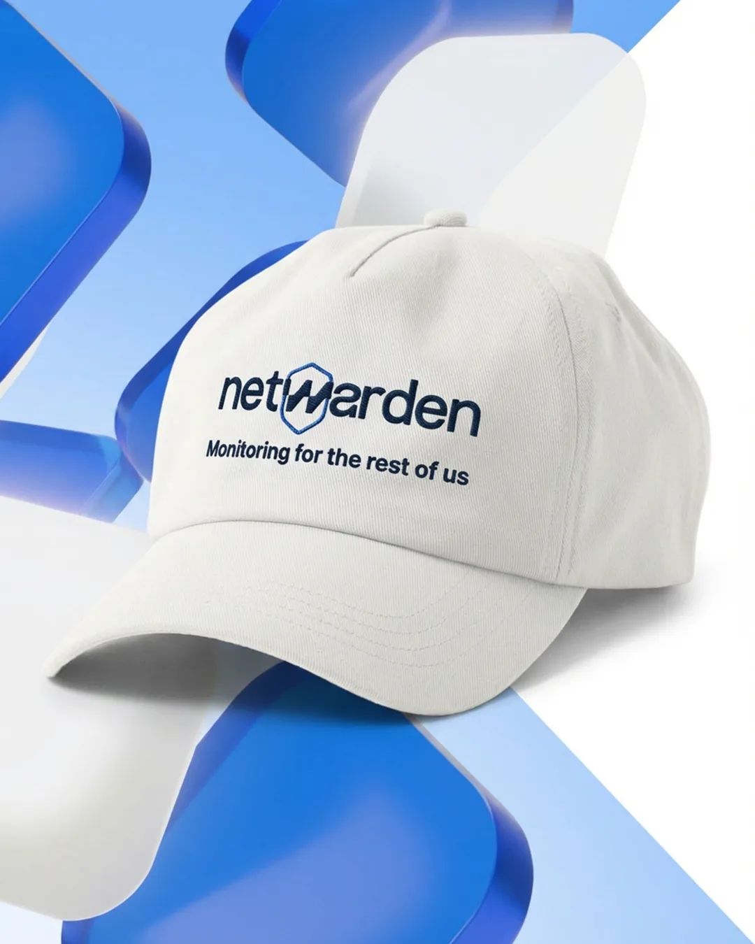
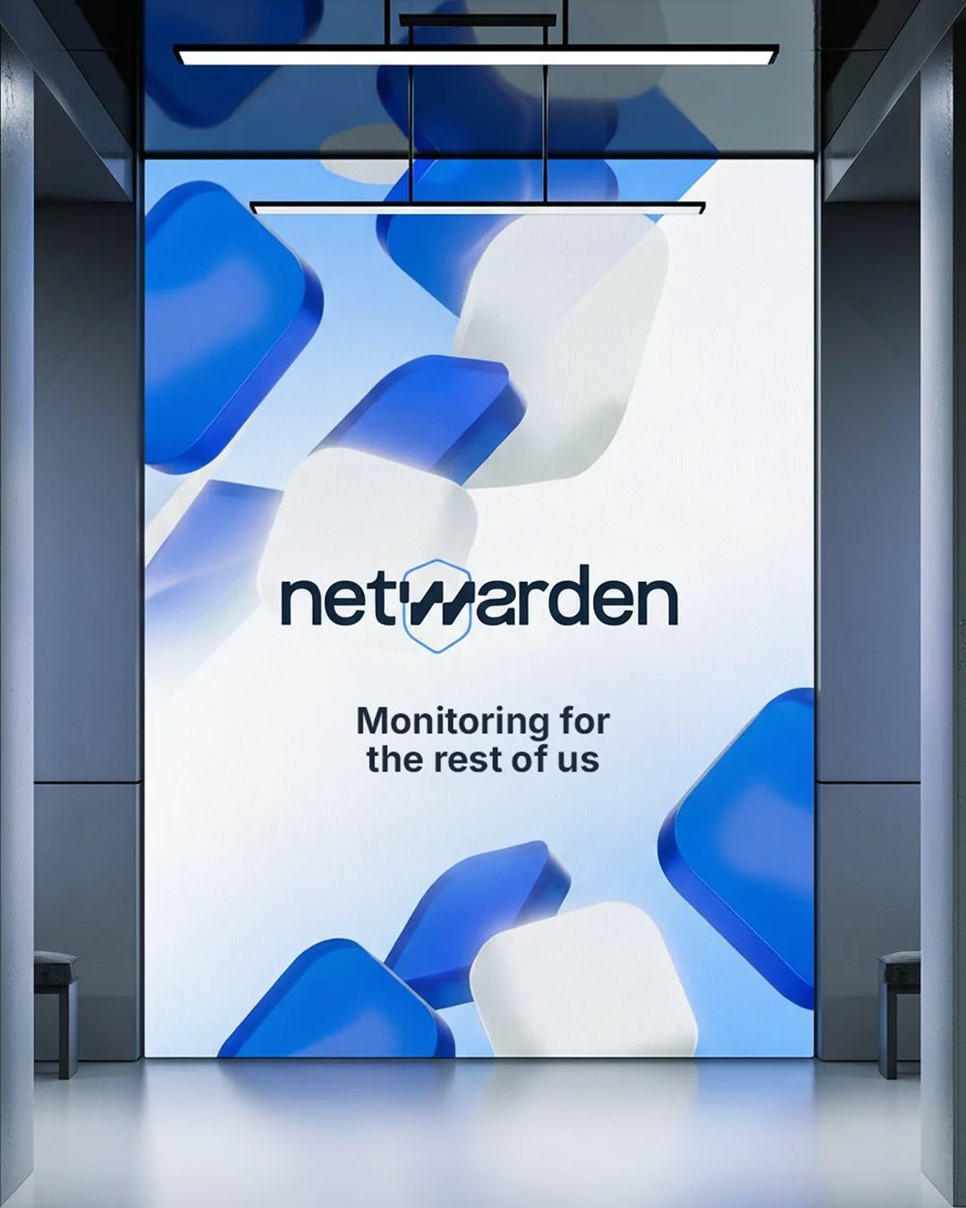
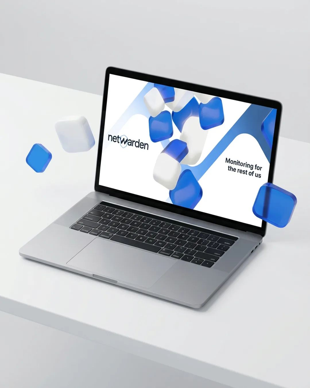
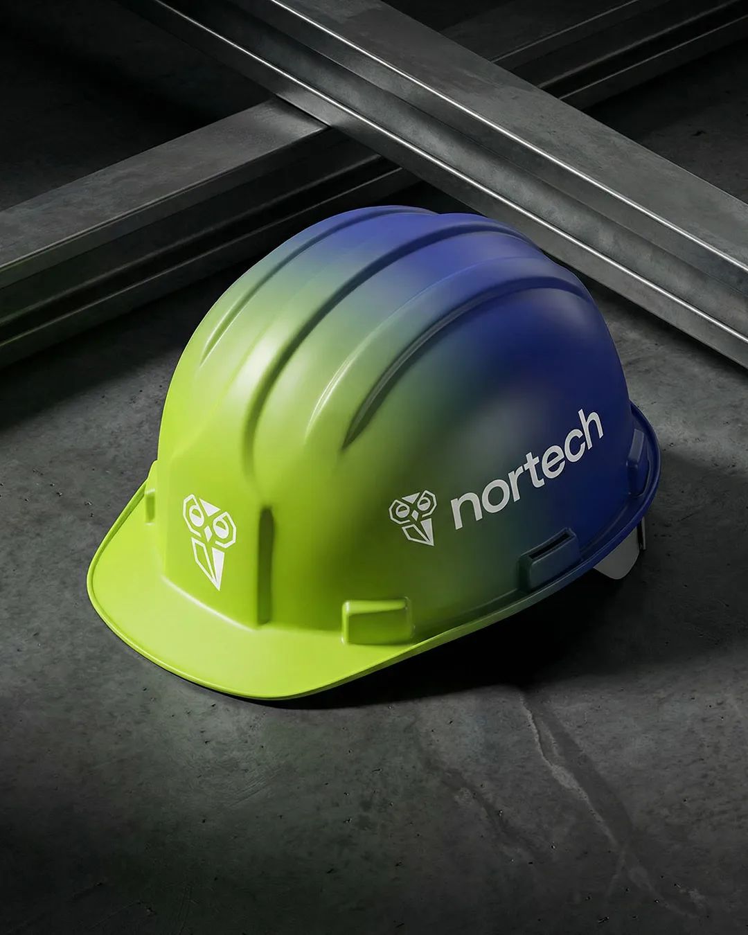
Delivered a full identity system applied across digital and physical touchpoints: app icon, laptop and smartwatch interfaces, stationery, apparel, and event materials — a cohesive visual language that makes a technical product feel like something people would actually want to use.