Sensory Kids
Client
Sensory Kids
Sector
Children's Occupational Therapy Clinic
Country
Brazil
Year
2021
Scope
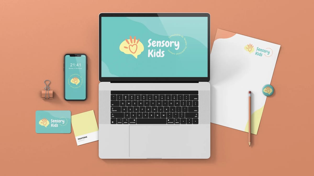
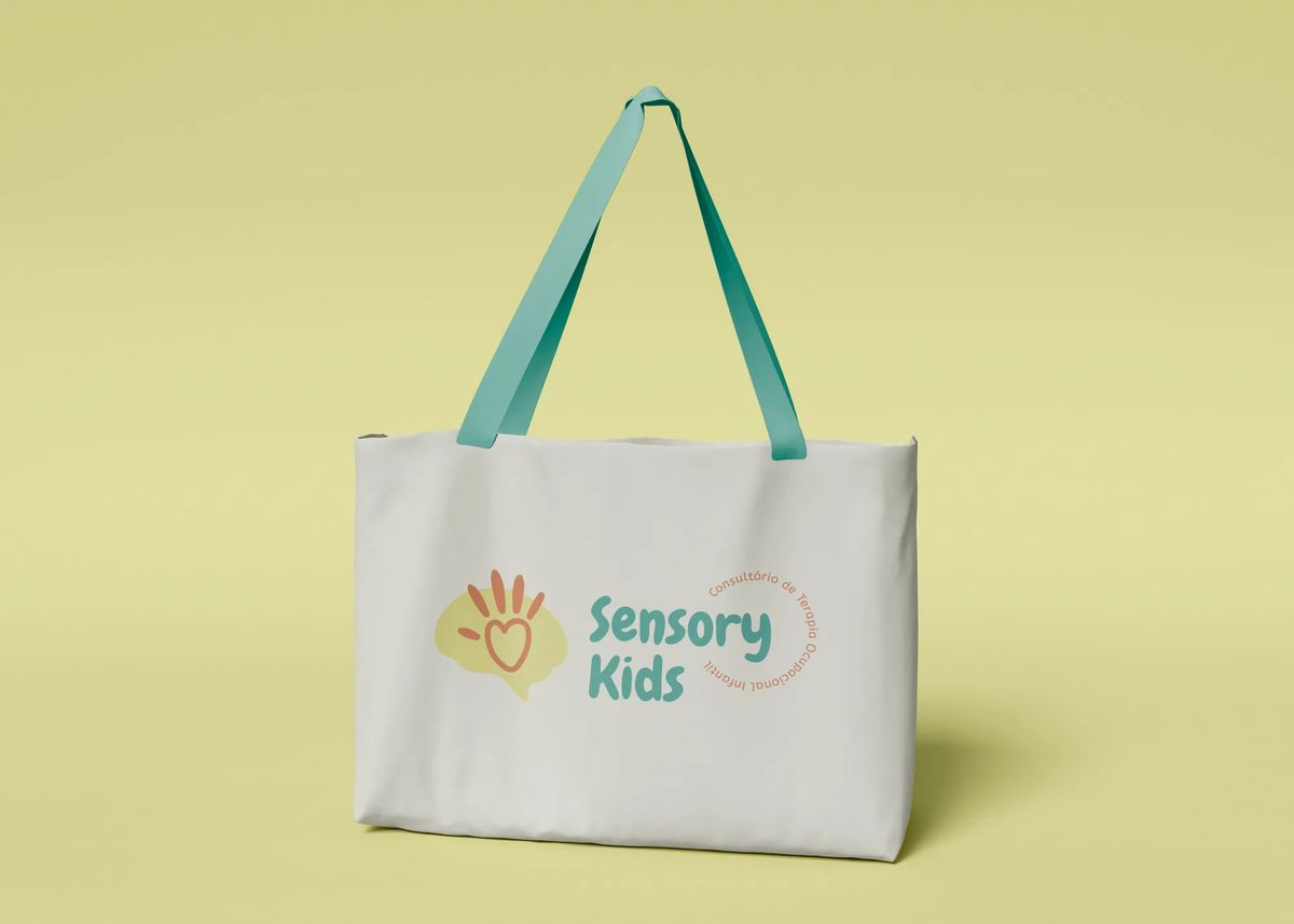
Brand Identity · Brand Guidelines · Stationary Kit
[ 01 — Context ]
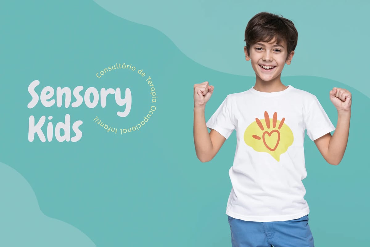
Sensory Kids is a children's occupational therapy clinic where science and emotion work hand in hand. A small business with a big purpose — and a brand that needed to hold both without losing either.
[ 02 — Approach ]
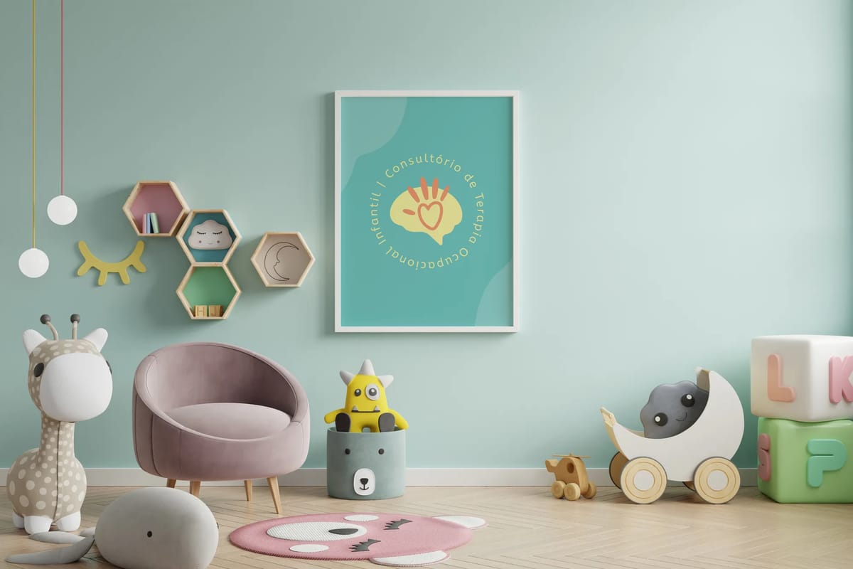
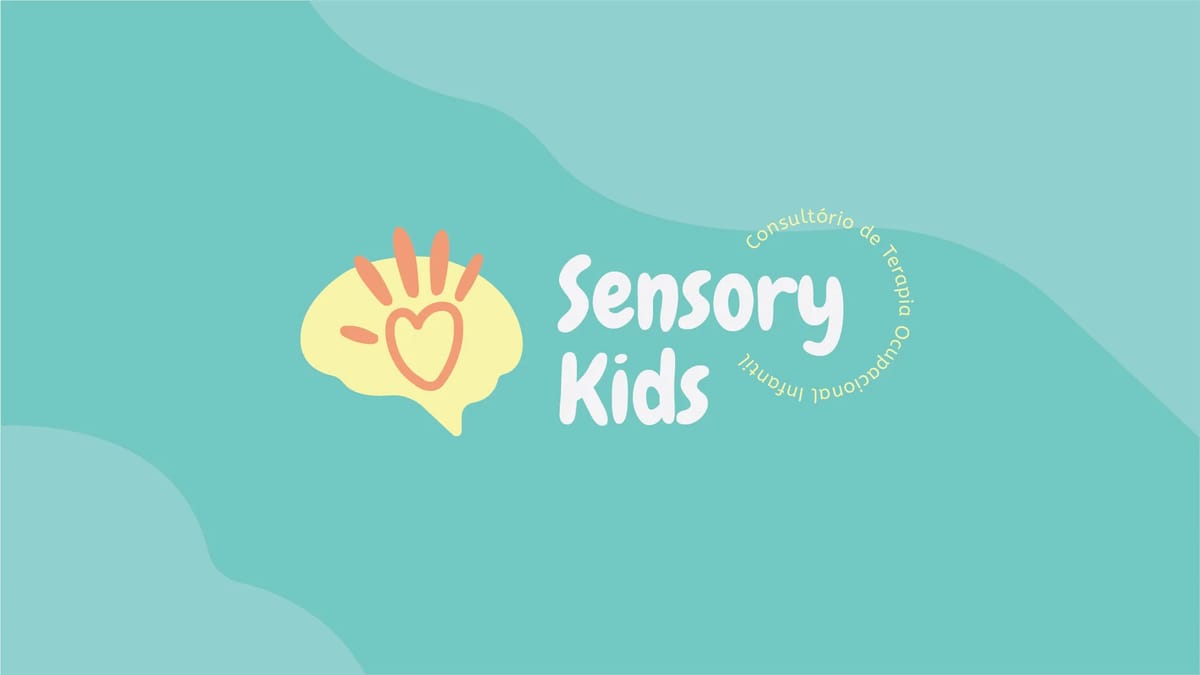
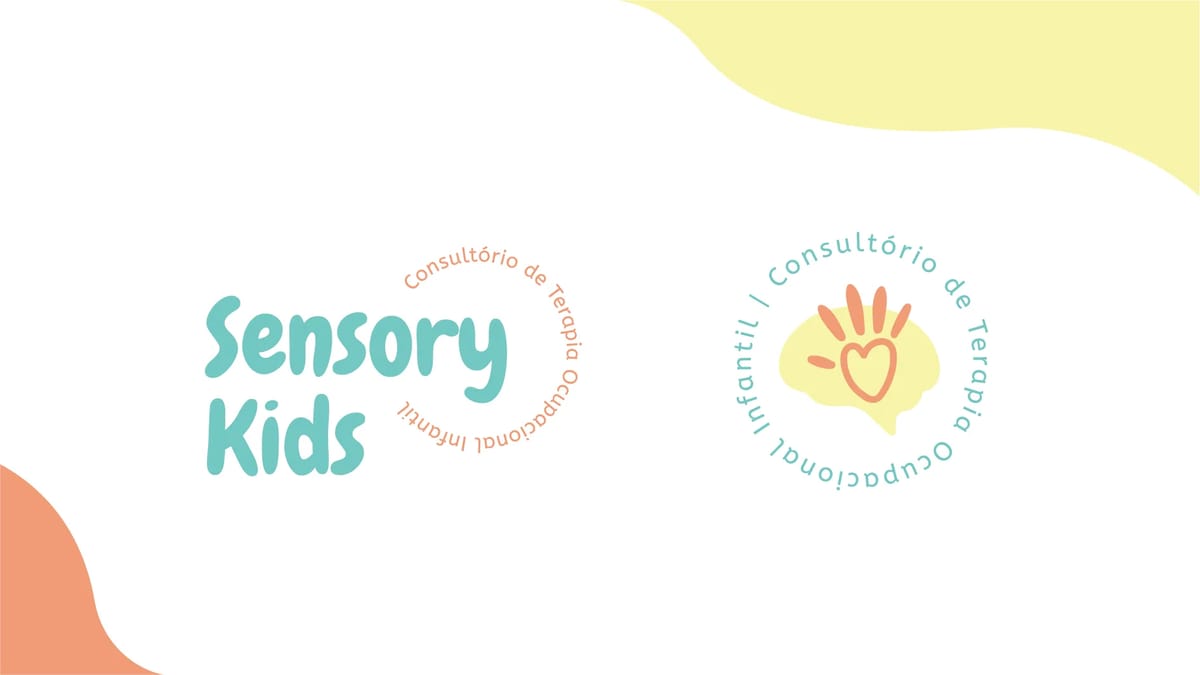
The icon brings together three ideas in one mark: a brain for the mind, hands for the senses, and a heart sitting in the palm — the connection between thought, touch, and feeling. Typography was chosen to be organic and playful, but still modern and easy to read. The palette balances hot pastels with neutral tones — energy and calm in the same breath, exactly what the practice offers its patients.
[ 03 — Outcome ]
A brand identity, brand guidelines, and stationery kit that captured something genuinely hard to put into visual form. The client felt it immediately: "This one, I gotta tell you, it was love at first sight."
[ Testimonial ]
I was really happy about how it turned out, everything was beautiful… But this one, I gotta tell you, it was love at first sight! Thanks for your care and hard work.
Franciani Michaelsen
Founder · Sensory Kids